Theme Guide
Color shows the state at a glance: green is fine, red is a zone to watch. This page goes from the simplest option, one line of YAML, to a fully restyled card: stop reading when you have what you need. The card must be installed first: see Installation.
Note
Nothing on this page can damage Home Assistant. To undo a change, remove the lines you added, press Save, then reload the page.
- Pick a ready-made theme. One line, such as
theme: battery_adaptive, and the bar changes color with the value: a battery, a CPU, a temperature... The limits are fixed:critical_when_low, for example, turns red under 10 %. - Draw your own zones (value ranges, each with its color).
Red under 20 %, green up to 80 %:
custom_themesets the limits you want.bar_color_modethen chooses how the zones are painted: one solid color, blocks or a gradient. - Choose a color by name. No zones needed:
bar_color: redpaints the bar,color: redthe icon. A name such asredortealfollows the colors of your Home Assistant theme; any CSS color works too. - Color from a condition (Jinja, a template written in text)? Use a Template
card:
colorandbar_color. Athemeset on the same card wins over both: use one or the other. Not available on a Multi-Card or Multi-Feature row. - Restyle the whole card (advanced, optional). CSS variables change the bar's background, the icon's shape, the markers... in a Home Assistant theme or with card_mod / uix (add-ons installed from HACS). The card structure gives the selectors.
- Size the card (advanced, optional). How the card picks its height in a Sections or Masonry view, a stack, a grid or a button-card, and how to change it.
- Something looks wrong? Nothing is broken: remove the lines you added,
press Save, then reload the page; the card goes back to its default look.
A bar in a single color is normal without
themeorcustom_theme; with one, check that the spaces at the start of each line match the example. - An error message on the card? See Troubleshooting.
- Time left on a washing machine? This page is only about colors: see The Laundry Mystery; the same idea works for any appliance that reports a remaining time, such as a dishwasher.
Predefined themes
The card's built-in color-zone presets, set with one line, such as
theme: critical_when_low. They are not Home Assistant themes. They work on the
card, the badge, the tile feature and each row of a Multi-Card or Multi-Feature.
The Template and Badge Template variants accept only the themes in % (not
temperature, voc, pm25).
Under most pictures below, Show ranges gives the limits of each color and
Show YAML the lines to copy (tap to open). To paste them, edit your
dashboard, open the card and choose Show code editor; then replace the
entity: value with the name of your own sensor, shown in the card editor's
Entity field. Want your own limits, e.g. red under 20 %? See
Custom theme.
Icons: light, temperature, humidity, voc and pm25 set their own; the
other themes keep the entity's icon. A theme's icon wins over icon:. Most
pictures show the theme at several values, between a bar in blocks (top) and a
gradient (bottom).
Red only marks the zone to watch: it is not an error. Purple, on humidity,
voc and pm25, marks an even worse zone.
| Value | Use for | Bar turns red when | Unit |
|---|---|---|---|
battery_adaptive |
Phone or laptop battery | under 10 %, over 90 % while charging | % |
critical_when_low |
Battery, stock | under 10 % | % |
optimal_when_low |
A low value is good | over 80 % | % |
critical_when_high |
CPU, RAM, disk usage | over 90 % | % |
optimal_when_high |
A high value is good | under 20 % | % |
critical_when_extreme |
Tank level, deviation | under 10 %, over 90 % | % |
critical_when_extreme_center |
Signed deviation (center_zero) |
under -80 %, over 80 % | % |
light |
Brightness | never | % |
temperature |
Temperature | over 30 °C | °C |
humidity |
Humidity | under 20 % (purple over 80 %) | % |
voc |
Air quality (VOC) | over 3000 ppb (purple over 25,000) | ppb |
pm25 |
Air quality (PM 2.5) | over 55 µg/m³ (purple over 150) | µg/m³ |
These limits are fixed; for other limits, e.g. red under 20 %, use
Custom theme. For blocks or a gradient instead of a solid bar,
see bar_color_mode.
Note
Most themes work in %. Three use real units: temperature, voc and
pm25. For these, theme: voc alone is enough: the card picks the scale from
the theme's zones. Defaults when min_value/max_value are not set:
| Theme | min_value |
max_value |
|---|---|---|
In % |
0 |
100 |
temperature, voc, pm25 |
0 |
the highest zone bound |
Same, with center_zero |
the lowest zone bound | the highest zone bound |
See max_value to override them.
Battery (battery_adaptive)


Use this for a phone or laptop battery. Unplugged, it uses the zones of
critical_when_low: red under 10 %. While charging, it uses
the zones of critical_when_extreme: green from 30 to 70
%, red under 10 % and over 90 %, since a battery ages faster when kept full.
Its ranges are those of these two themes. The card detects charging the same way
as icon_animation: battery_charging: from an attribute, the state, or another
entity of the same device.
Show YAML
type: custom:entity-progress-card
entity: sensor.phone_battery_level
theme: battery_adaptive
Critical when low (critical_when_low)
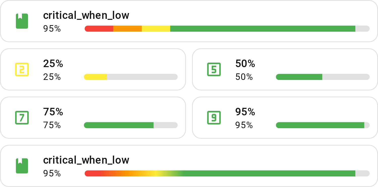
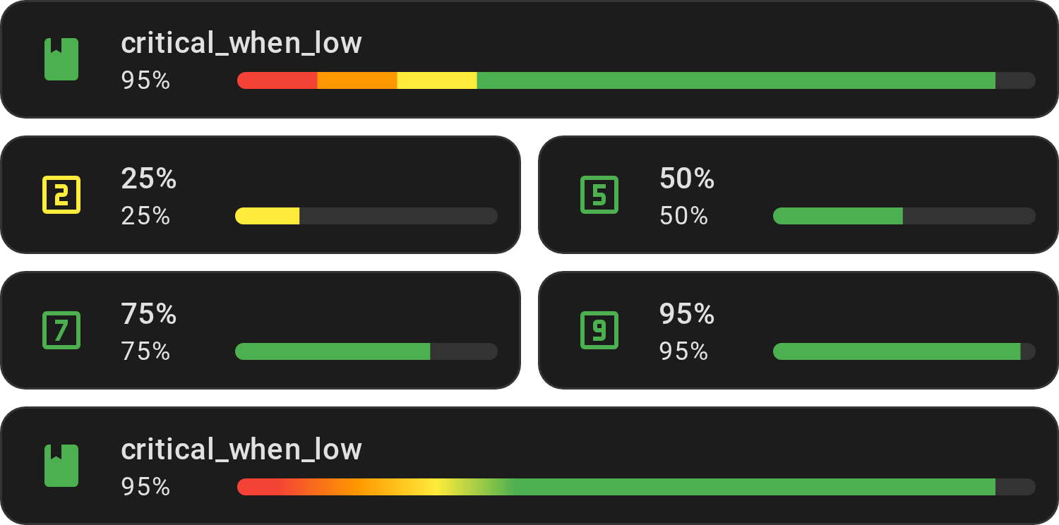
Use for a value that is only a problem near zero, such as a battery or a stock. Red under 10 %, green from 30 %: the zones narrow near zero to warn early.
Show YAML
type: custom:entity-progress-card
entity: sensor.phone_battery_level
theme: critical_when_low
Show ranges
| Range (%) | Color | Description |
|---|---|---|
| 0% – 10% | red |
Critical |
| 10% – 20% | orange |
Low |
| 20% – 30% | yellow |
Watch |
| 30% – 100% | green |
Fine |
Optimal when low (optimal_when_low)
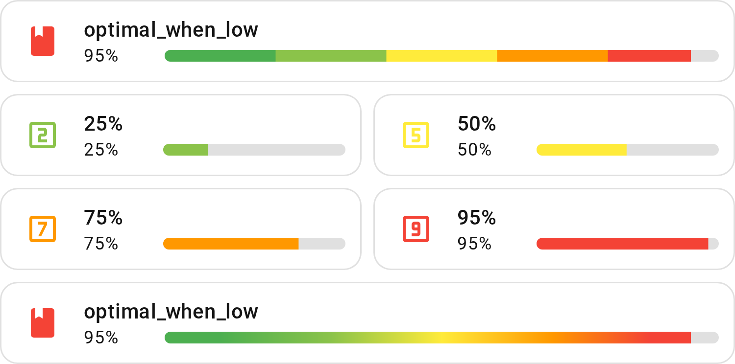
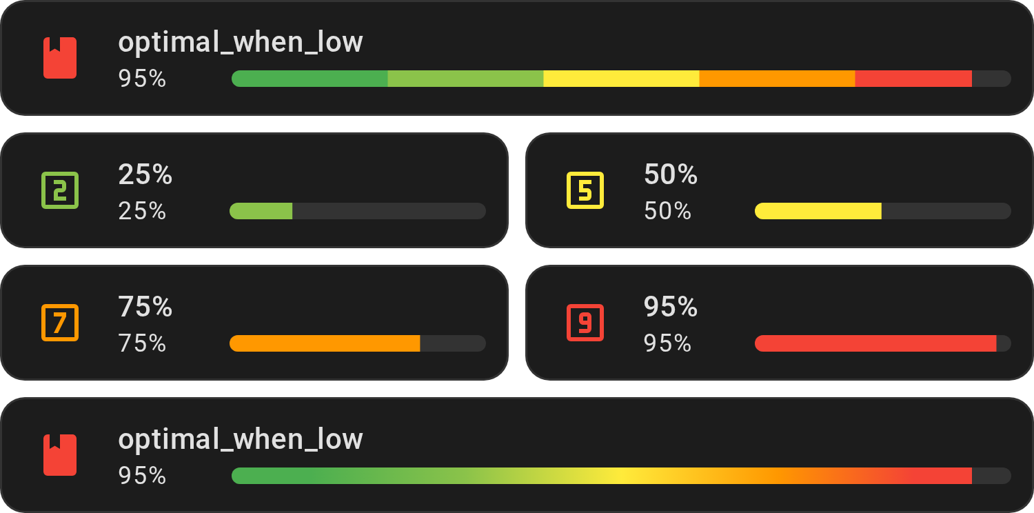
Use for a value where low is good, such as a load or a usage. Green at the bottom, red over 80 %, in five even zones.
Show YAML
type: custom:entity-progress-card
entity: sensor.system_monitor_cpu_usage
theme: optimal_when_low
Show ranges
| Range (%) | Color | Description |
|---|---|---|
| 0% – 20% | green |
Low level / Safe |
| 20% – 40% | light-green |
Good |
| 40% – 60% | yellow |
Moderate |
| 60% – 80% | orange |
Elevated |
| 80% – 100% | red |
High / Critical |
Critical when high (critical_when_high)
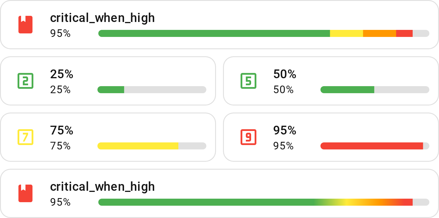
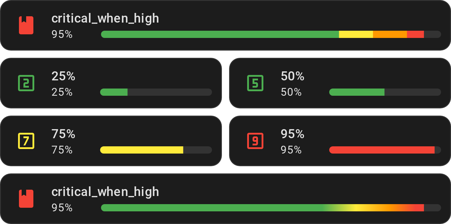
Use for a value that is only a problem near 100 %, such as CPU, RAM or disk
usage. Red over 90 %: the mirror of critical_when_low.
Show YAML
type: custom:entity-progress-card
entity: sensor.system_monitor_cpu_usage
theme: critical_when_high
Show ranges
| Range (%) | Color | Description |
|---|---|---|
| 0% – 70% | green |
Fine |
| 70% – 80% | yellow |
Watch |
| 80% – 90% | orange |
High |
| 90% – 100% | red |
Critical |
Optimal when high (optimal_when_high)
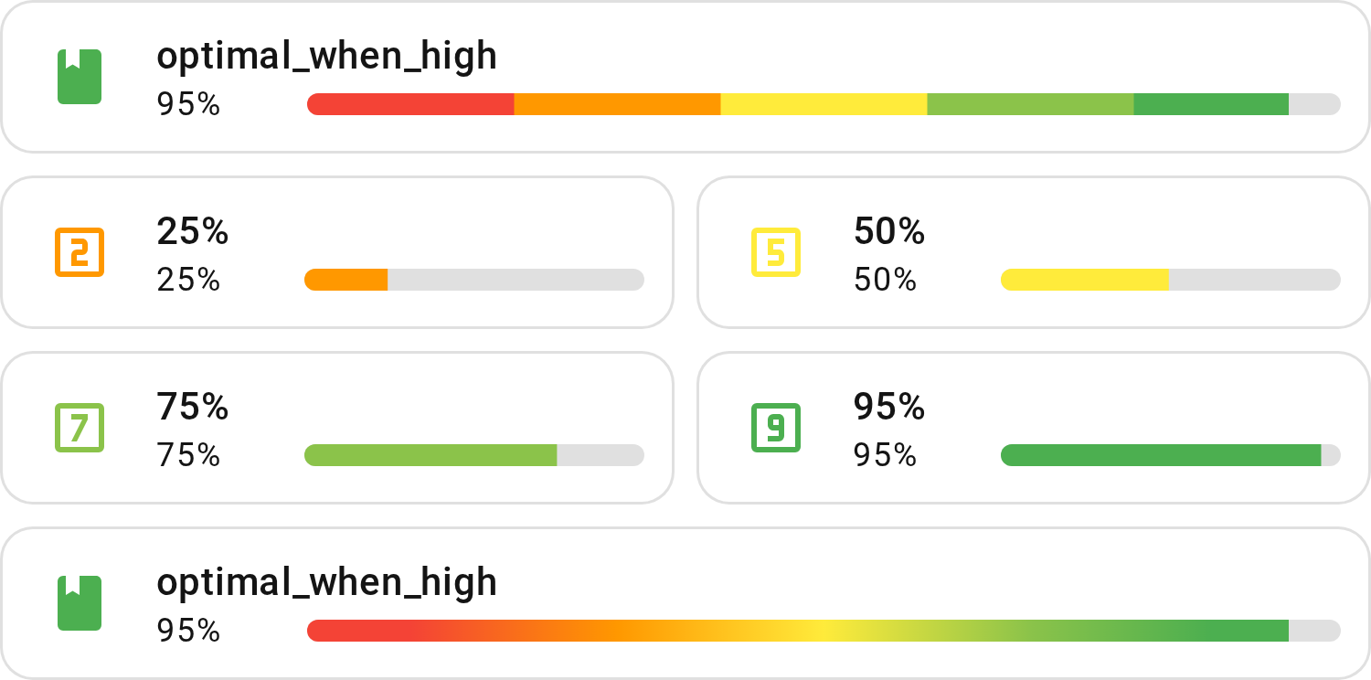
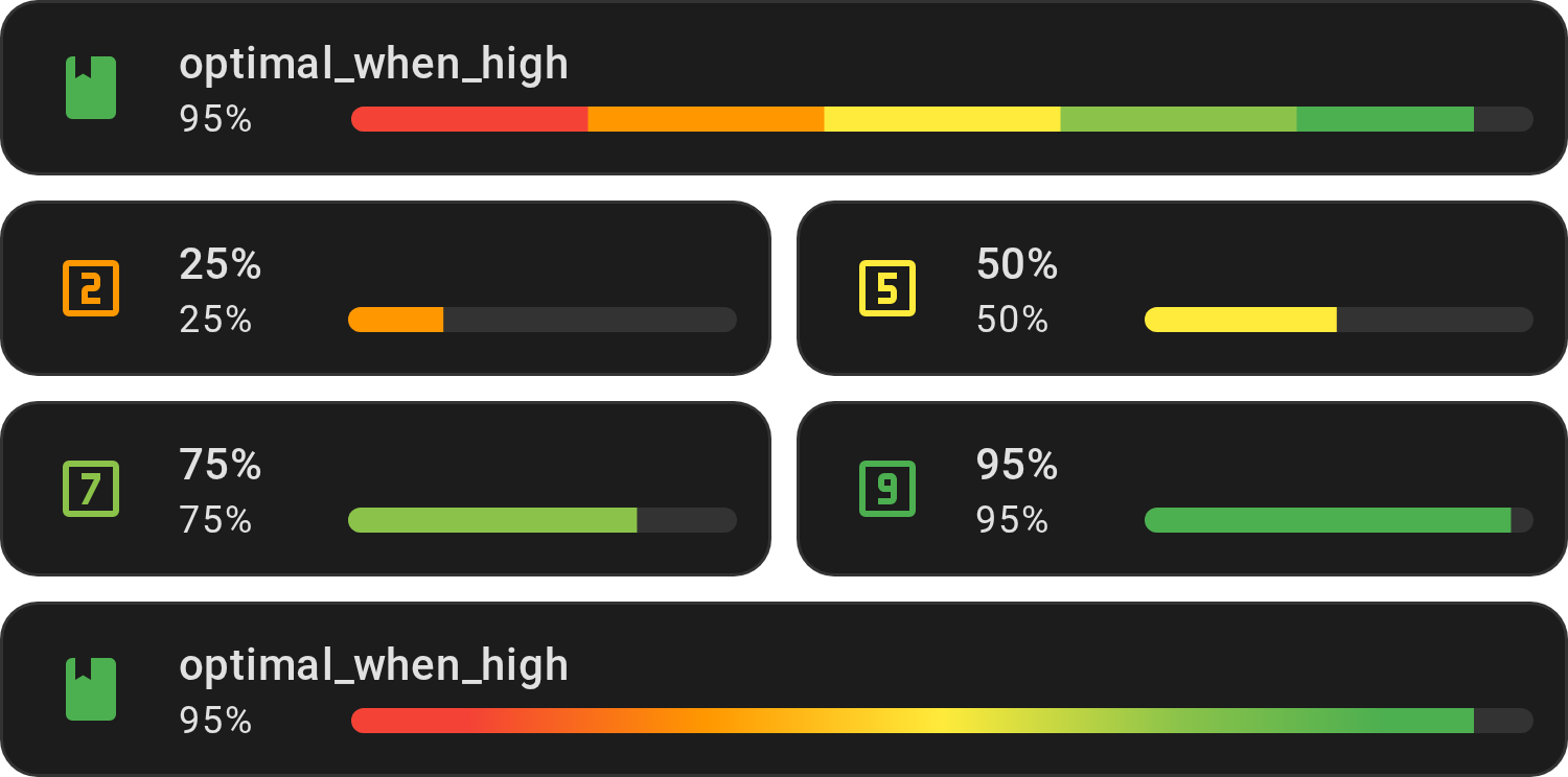
Use for a value where high is good. Red under 20 %, green at the top, in five
even zones: the mirror of optimal_when_low.
Show YAML
type: custom:entity-progress-card
entity: sensor.phone_battery_level
theme: optimal_when_high
Show ranges
| Range (%) | Color | Description |
|---|---|---|
| 0% – 20% | red |
Critical / Very low |
| 20% – 40% | orange |
Low |
| 40% – 60% | yellow |
Moderate |
| 60% – 80% | light-green |
Good |
| 80% – 100% | green |
Optimal / High |
Critical when extreme (critical_when_extreme)
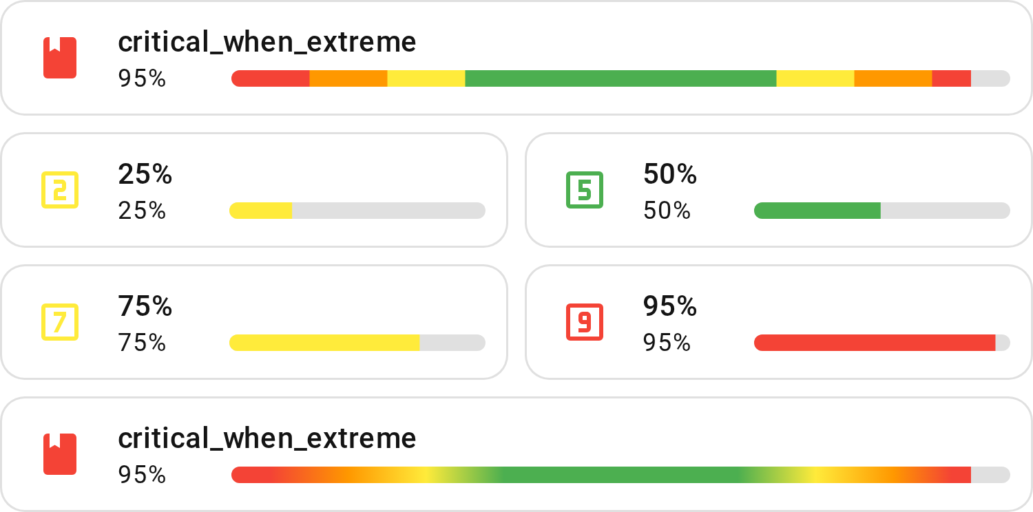
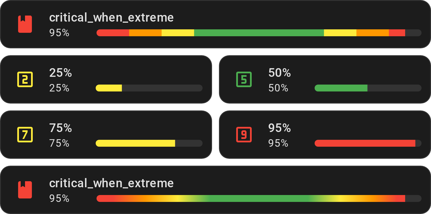
Use when both ends are a problem, such as a tank (too empty or too full). Red under 10 % and over 90 %, green from 30 to 70 %.
Show YAML
type: custom:entity-progress-card
entity: sensor.water_tank_level
theme: critical_when_extreme
Show ranges
| Range (%) | Color | Description |
|---|---|---|
| 0% – 10% | red |
Critical |
| 10% – 20% | orange |
Low |
| 20% – 30% | yellow |
Watch |
| 30% – 70% | green |
Fine |
| 70% – 80% | yellow |
Watch |
| 80% – 90% | orange |
High |
| 90% – 100% | red |
Critical |
Centered extreme (critical_when_extreme_center)


Use with center_zero for a value that swings
both ways, such as a net power flow or a deviation from a setpoint. One scale
from -100 % to 100 %: green around zero, red under -80 % and over 80 %.
Show YAML
type: custom:entity-progress-card
entity: sensor.battery_power_flow
center_zero: true
theme: critical_when_extreme_center
Show ranges
| Range (%) | Color | Description |
|---|---|---|
| -100% – -80% | red |
Critical |
| -80% – -60% | orange |
Low |
| -60% – -40% | yellow |
Watch |
| -40% – 40% | green |
Fine (centered on zero) |
| 40% – 60% | yellow |
Watch |
| 60% – 80% | orange |
High |
| 80% – 100% | red |
Critical |
Note
Outside center_zero, this theme only shows its 0–100 % half: use
critical_when_extreme instead on a card without center_zero.
Light (light)
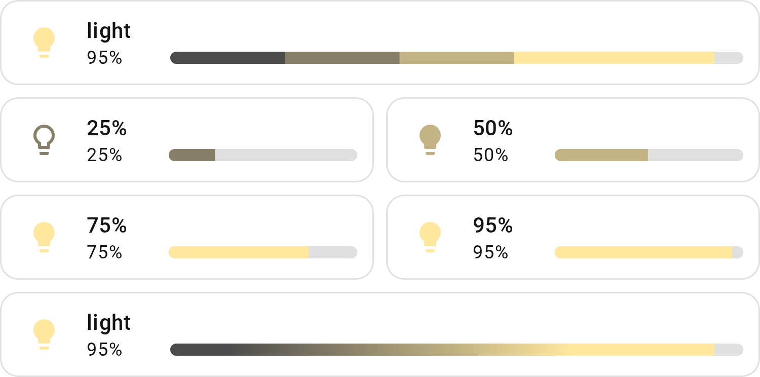
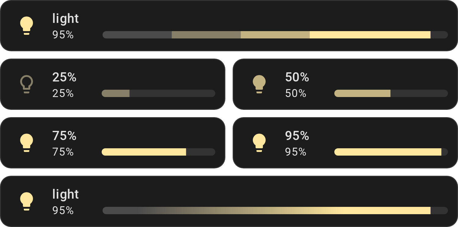
Use for a light's brightness. The color moves smoothly from dim grey to warm
yellow, and the icon turns from mdi:lightbulb-outline to mdi:lightbulb as
the light gets brighter. Never red. Designed by
@harmonie-durrant.
Colors blend between the stops listed under Show ranges below, and the icon
switches at 50 %. With bar_color_mode, the 5 stops become
equal zones instead: 0–20 %, 20–40 %, and so on.
Show YAML
type: custom:entity-progress-card
entity: light.bandeau_led
attribute: brightness
theme: light
icon_tap_action:
  action: more-info
Show ranges
| Stop | Color | Description | Icon |
|---|---|---|---|
| 0 % | #4B4B4B |
Dim light | mdi:lightbulb-outline |
| 25 % | #877F67 |
Soft warm light | mdi:lightbulb-outline |
| 50 % | #C3B382 |
Medium warm light | mdi:lightbulb |
| 75 % | #FFE79E |
Bright warm light | mdi:lightbulb |
| 100 % | #FFE79E |
Maximum brightness | mdi:lightbulb |
Temperature (temperature)
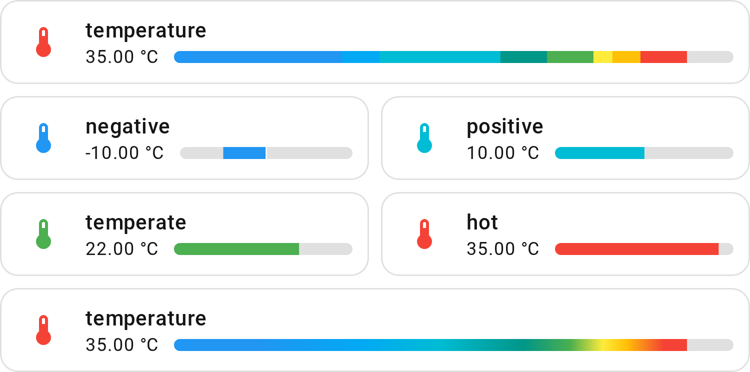
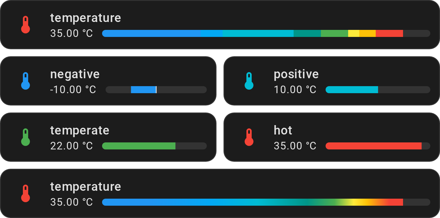
min_value and max_value are optional. Without them the bar runs from 0 to
100 °C, so readings below zero don't show; here they narrow it to -20–45 °C.
Show YAML
type: custom:entity-progress-card
entity: sensor.living_room_temperature
unit: °C
min_value: -20
max_value: 45
theme: temperature
icon_tap_action:
  action: more-info
Show ranges
| Temperature Range (°C / °F) | Color | Description |
|---|---|---|
| -50°C – -20°C / -58°F – -4°F | indigo |
Extremely cold |
| -20°C – -2°C / -4°F – 28.4°F | blue |
Very cold |
| -2°C – 2°C / 28.4°F – 35.6°F | light-blue |
Cold |
| 2°C – 15°C / 35.6°F – 59°F | cyan |
Cool |
| 15°C – 20°C / 59°F – 68°F | teal |
Mild |
| 20°C – 25°C / 68°F – 77°F | green |
Optimal |
| 25°C – 27°C / 77°F – 80.6°F | yellow |
Warm |
| 27°C – 30°C / 80.6°F – 86°F | amber |
Hot |
| 30°C – 100°C / 86°F – 212°F | red |
Extremely hot |
Important
Fahrenheit values are converted to apply the correct color. Make sure to set
your unit to °F correctly in order to see the accurate color representation.
Humidity (humidity)
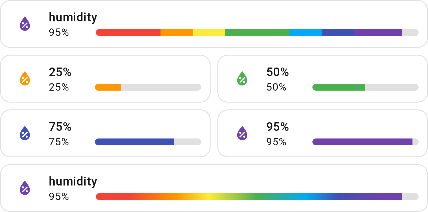
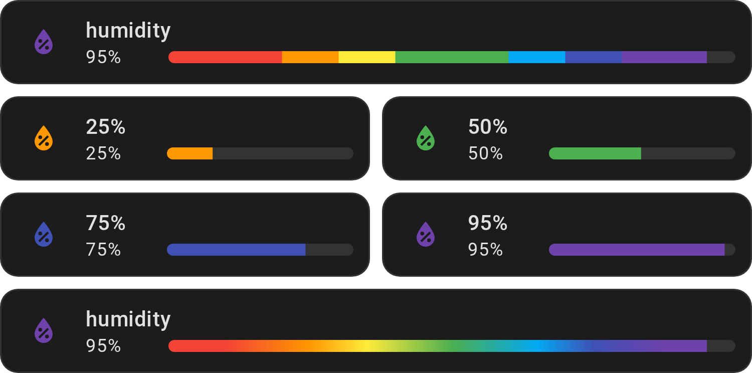
Use for indoor humidity. Green from 40 to 60 %, red under 20 % (too dry), purple
over 80 % (too humid), with the mdi:water-percent icon.
Show YAML
type: custom:entity-progress-card
entity: sensor.living_room_humidity
theme: humidity
icon_tap_action:
  action: more-info
Show ranges
| Humidity Range | Color | Description |
|---|---|---|
| 0% – 20% | red |
Very dry air |
| 20% – 30% | orange |
Dry air |
| 30% – 40% | yellow |
Slightly dry air |
| 40% – 60% | green |
Optimal humidity |
| 60% – 70% | light-blue |
Slightly humid air |
| 70% – 80% | indigo |
Humid air |
| 80% – 100% | deep-purple |
Very humid air |
VOC (voc)
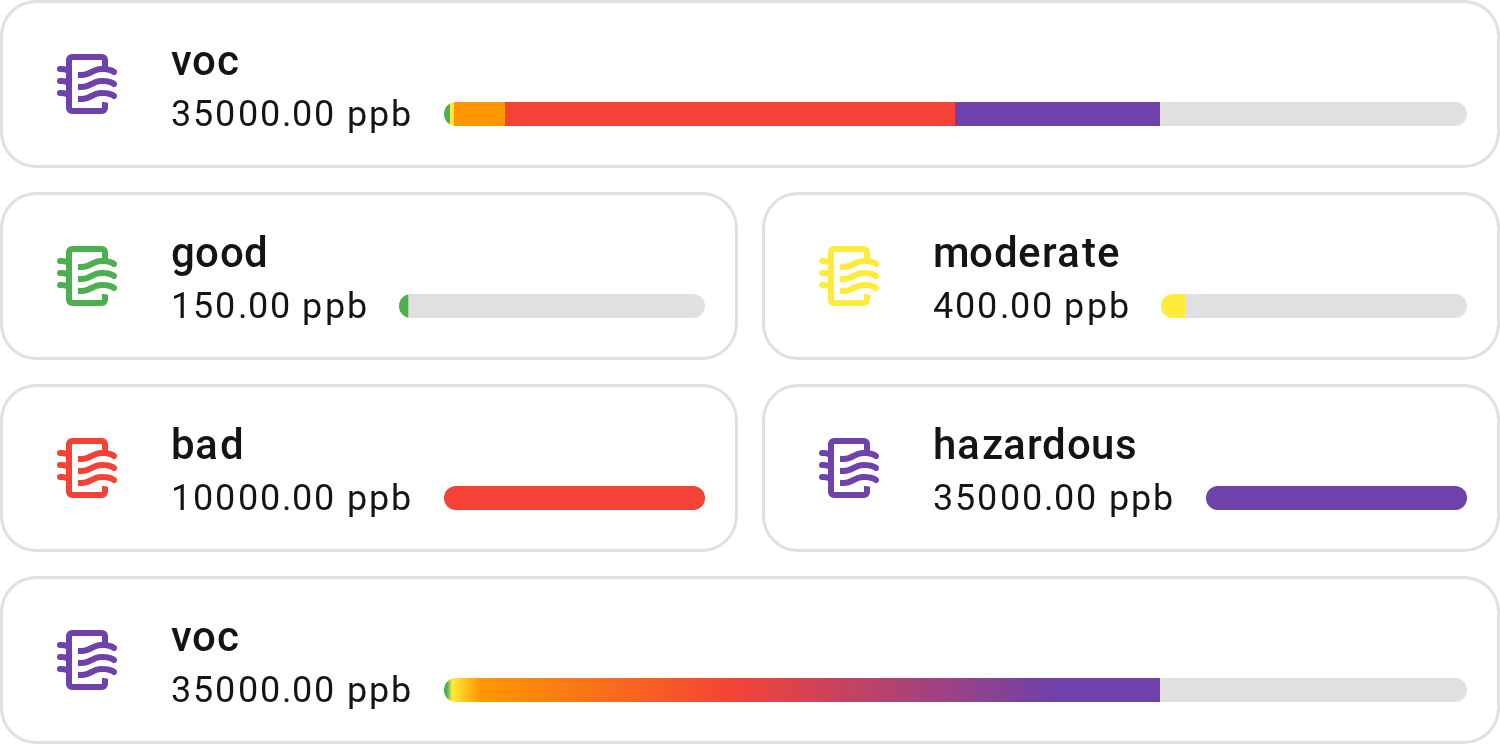
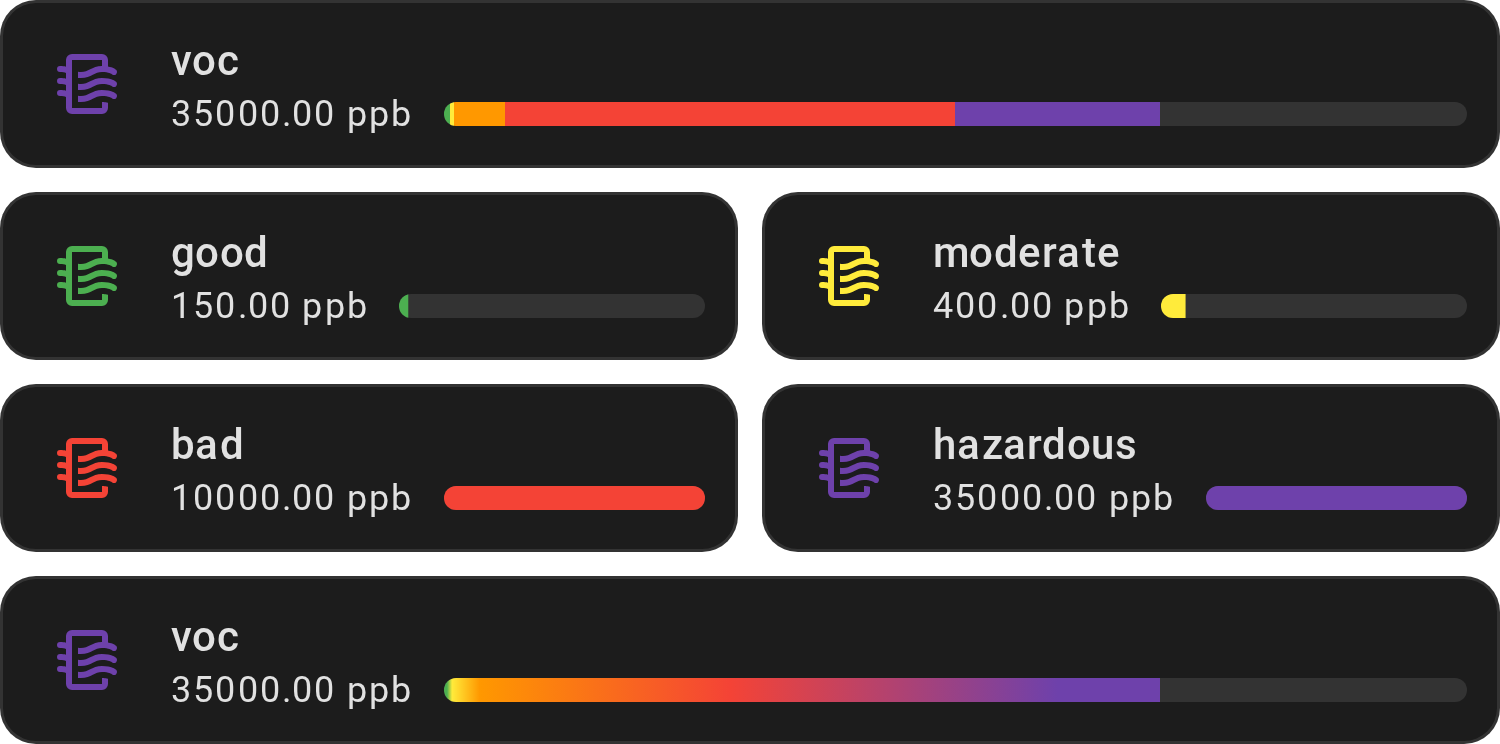
Use for volatile organic compounds (VOC), in ppb. Green up to 300, red over
3000, purple over 25,000, with the mdi:air-filter icon.
Show YAML
type: custom:entity-progress-card
entity: sensor.living_room_voc
unit: ppb
decimal: 0
theme: voc
icon_tap_action:
  action: more-info
Show ranges
| TVOC Range (ppb) | Color | Description |
|---|---|---|
| 0 – 300 | green |
Good air quality |
| 300 – 500 | yellow |
Acceptable air quality |
| 500 – 3000 | orange |
Moderate air quality |
| 3000 – 25,000 | red |
Poor air quality |
| 25,000 – 50,000 | deep-purple |
Hazardous |
Important
The information provided in this HA card is based on thresholds from the
following
source.
This color code is for informational purposes only and should not be taken as
professional advice or a standard to follow. It is crucial to consult the
device's official documentation or current standards for the most accurate and
up-to-date information. In case of any discrepancy between the information
provided here and the device's documentation or current standards, the latter
shall prevail. The lower the value, the better it is generally considered to
be. With this card you can use custom_theme to define your own ranges.
PM 2.5 (pm25)
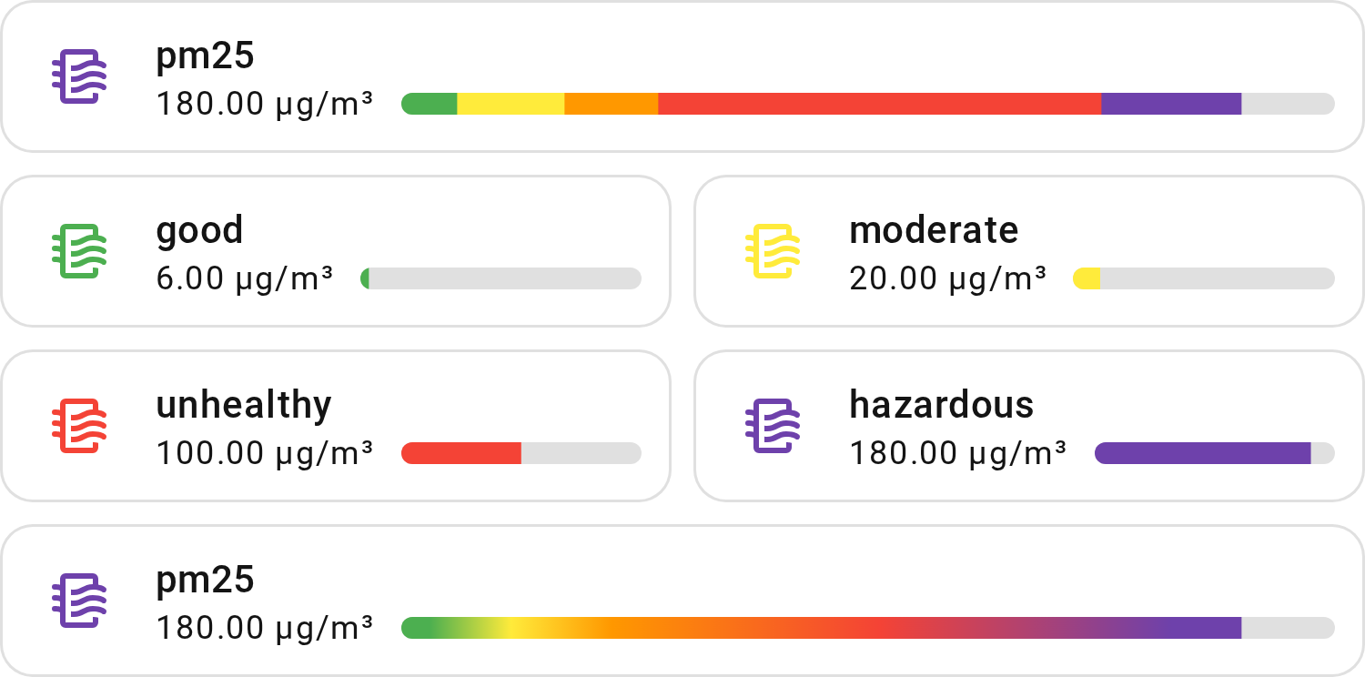
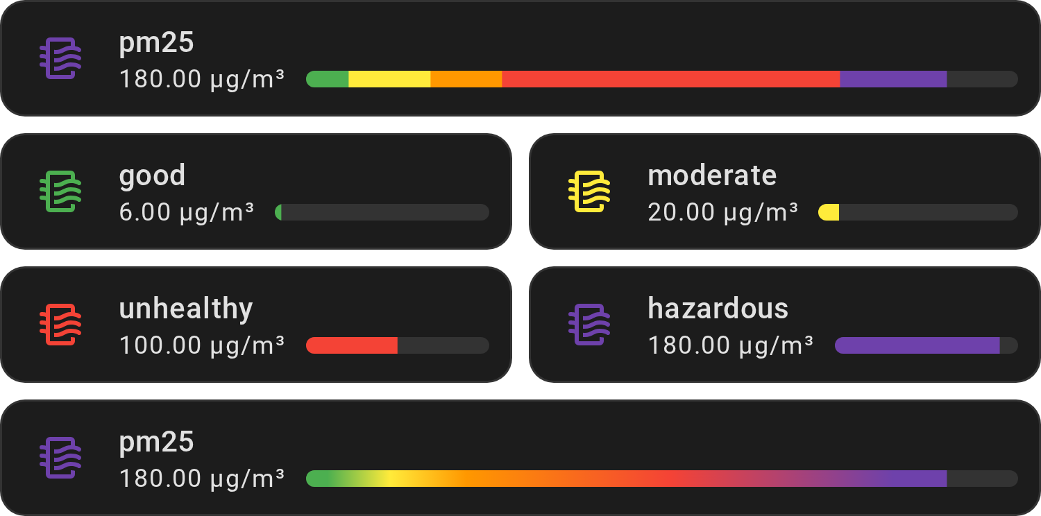
Use for fine particles (PM 2.5), in µg/m³. Green up to 12, red over 55, purple
over 150, with the mdi:air-filter icon.
Show YAML
type: custom:entity-progress-card
entity: sensor.living_room_pm25
unit: µg/m³
decimal: 0
theme: pm25
icon_tap_action:
  action: more-info
Show ranges
| PM2.5 Range (µg/m³) | Color | Description |
|---|---|---|
| 0 – 12 | green |
Good air quality |
| 12 – 35 | yellow |
Moderate air quality |
| 35 – 55 | orange |
Unhealthy for sensitive groups |
| 55 – 150 | red |
Unhealthy air quality |
| 150 – 200 | deep-purple |
Very unhealthy air quality |
Important
The information provided in this HA card is based on thresholds from the
following
source.
This color code is for informational purposes only and should not be taken as
professional advice or a standard to follow. It is crucial to consult the
device's official documentation or current standards for the most accurate and
up-to-date information. In case of any discrepancy between the information
provided here and the device's documentation or current standards, the latter
shall prevail. The lower the value, the better it is generally considered to
be. With this card you can use custom_theme to define your own ranges.
Custom theme
custom_theme replaces theme: set one, not both. Works on the card, the
badge, the tile feature and each row of a Multi-Card or Multi-Feature. The
Template and Badge Template variants color with Jinja instead:
color and
bar_color. A Multi-Card or Multi-Feature
row has no Jinja color: use custom_theme there (zones follow the row's own
value only). For rows colored by a condition, stack Template cards (a
vertical-stack) instead of a Multi-Card.
Your own color zones, e.g. a battery red under 20 %, green up to 80 %, orange above:


type: custom:entity-progress-card
entity: sensor.phone_battery_level
custom_theme:
  - min: 0
    max: 20
    color: red
  - min: 20
    max: 80
    color: green
  - min: 80
    max: 100
    color: orange
Paste it in the card's code editor (Show code editor in the card editor) and
replace sensor.phone_battery_level with your own sensor. A value on a limit
takes the zone that starts there: at exactly 20 %, the bar is green. A value
that falls between two zones uses your color if set, otherwise the card's
default color; below the first zone or above the last, it takes that zone's
color.
Each entry of custom_theme needs min and
max; a color key (color, bar_color, icon_color) and icon are optional.
The bar and the icon can take separate colors instead of one shared color:
Show YAML
type: custom:entity-progress-card
entity: sensor.phone_battery_level
custom_theme:
  - min: 0
    max: 50
    bar_color: blue
    icon_color: white
  - min: 50
    max: 100
    bar_color: green
    icon_color: green
Note
min/max set one zone; min_value/max_value set the whole bar's scale.
min/max are in the sensor's own unit: % for a battery, °C or ppb for
others.
Zones don't need to be contiguous or declared in order — see
custom_theme in the configuration reference
for exactly how gaps, overlaps, and incomplete zones behave.
custom_theme never changes the bar's default range, 0–100:
- a zone past it (e.g. up to
120on a%sensor) is cut at100, not stretched to fit; - if your entity's real range is not
0–100, setmin_value/max_valueto match your zones.
Blocks or gradient (bar_color_mode)
The bar_color_mode parameter controls how theme colors are rendered on the
progress bar. It needs a theme: set theme or custom_theme. Without one, the
bar keeps a single color (this is normal).
| Value | Description |
|---|---|
auto |
Default. The bar is filled with the solid color of the current zone. |
segment |
Each zone is drawn as a distinct colored block up to the current value. |
rainbow |
A smooth gradient flows across all visible zone colors. |
rainbow_full |
The track always shows the full gradient; a marker slides to the current value. |
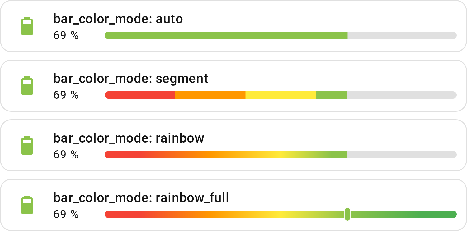
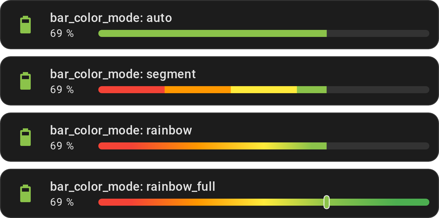
A battery at 69 % with optimal_when_high, top to bottom: auto paints one
solid color, the current zone's; segment draws one block per zone, red to 20
%, orange to 40 %, yellow to 60 %, then light green up to 69 %; rainbow blends
the same colors up to the value; rainbow_full always shows the whole gradient,
with a marker at the value.
Show YAML
# segment
type: custom:entity-progress-card
entity: sensor.battery_level
theme: optimal_when_high
bar_color_mode: segment
# rainbow
type: custom:entity-progress-card
entity: sensor.battery_level
theme: optimal_when_high
bar_color_mode: rainbow
Note
bar_color_mode with center_zero, where the
bar grows both ways from zero:
- a signed theme (
critical_when_extreme_center) is one curve across both arms; - a theme in % reads 0–100 % on each arm: the positive arm shows its zones, the negative arm takes the first zone's color;
- a theme in real units (
temperature) is spread over each arm's half ofmin_value–max_value; rainbow_fullgives each arm its own full gradient, the marker crossing the center at zero.
Color names
Use these names anywhere a color is expected: color
(the icon), bar_color (the bar), and the color
keys of a custom_theme zone.
type: custom:entity-progress-card
entity: sensor.phone_battery_level
bar_color: teal
color: teal
The names below follow your Home Assistant theme, so red matches the red of
the rest of your dashboard. Any other CSS color also works (salmon, #ff6600,
rgb(255, 102, 0)), drawn as the browser defines it. A color missing?
Open an issue.


The Text, Status, Interface and Home Assistant state names below have no picture: they follow your theme too.
Standard colors
The 26 names of the picture above: each name x maps to var(--x-color), so
red gives var(--red-color). You can also write var(--red-color) yourself.
Text
| Color name | CSS variable |
|---|---|
primary-text |
var(--primary-text-color) |
secondary-text |
var(--secondary-text-color) |
text-primary |
var(--text-primary-color) |
text-light-primary |
var(--text-light-primary-color) |
disabled-text |
var(--disabled-text-color) |
Status
| Color name | CSS variable |
|---|---|
success |
var(--success-color) |
warning |
var(--warning-color) |
error |
var(--error-color) |
info |
var(--info-color) |
Interface/UI
| Color name | CSS variable |
|---|---|
dark-primary |
var(--dark-primary-color) |
darker-primary |
var(--darker-primary-color) |
light-primary |
var(--light-primary-color) |
divider |
var(--divider-color) |
outline |
var(--outline-color) |
outline-hover |
var(--outline-hover-color) |
shadow |
var(--shadow-color) |
HA State
Show all Home Assistant state colors
Each name maps to Home Assistant's --<name>-color variable. Example:
color: state-climate-heat gives the color Home Assistant uses for a heating
thermostat.
| Color name |
|---|
state-active |
state-inactive |
state-unavailable |
state-alarm_control_panel-armed_away |
state-alarm_control_panel-armed_custom_bypass |
state-alarm_control_panel-armed_home |
state-alarm_control_panel-armed_night |
state-alarm_control_panel-armed_vacation |
state-alarm_control_panel-arming |
state-alarm_control_panel-disarming |
state-alarm_control_panel-pending |
state-alarm_control_panel-triggered |
state-alert-off |
state-alert-on |
state-binary_sensor-active |
state-binary_sensor-battery-on |
state-binary_sensor-carbon_monoxide-on |
state-binary_sensor-gas-on |
state-binary_sensor-glass_break-on |
state-binary_sensor-heat-on |
state-binary_sensor-lock-on |
state-binary_sensor-moisture-on |
state-binary_sensor-problem-on |
state-binary_sensor-safety-on |
state-binary_sensor-smoke-on |
state-binary_sensor-sound-on |
state-binary_sensor-tamper-on |
state-climate-auto |
state-climate-cool |
state-climate-dry |
state-climate-fan_only |
state-climate-heat |
state-climate-heat-cool |
state-cover-active |
state-device_tracker-active |
state-device_tracker-home |
state-fan-active |
state-humidifier-on |
state-lawn_mower-active |
state-lawn_mower-error |
state-light-active |
state-lock-jammed |
state-lock-locked |
state-lock-locking |
state-lock-open |
state-lock-opening |
state-lock-unlocked |
state-lock-unlocking |
state-media_player-active |
state-person-active |
state-person-home |
state-plant-active |
state-sensor-battery-high |
state-sensor-battery-low |
state-sensor-battery-medium |
state-siren-active |
state-sun-above_horizon |
state-sun-below_horizon |
state-switch-active |
state-update-active |
state-vacuum-active |
state-vacuum-error |
state-valve-active |
state-water_heater-eco |
state-water_heater-electric |
state-water_heater-gas |
state-water_heater-heat_pump |
state-water_heater-high_demand |
state-water_heater-performance |
state-weather-clear_night |
state-weather-cloudy |
state-weather-exceptional |
state-weather-fog |
state-weather-hail |
state-weather-lightning |
state-weather-lightning_rainy |
state-weather-partlycloudy |
state-weather-pouring |
state-weather-rainy |
state-weather-snowy |
state-weather-snowy_rainy |
state-weather-sunny |
state-weather-windy |
state-weather-windy_variant |
Restyle with CSS variables (advanced)
You do not need this section for a ready-made theme. The --epb-* variables
below restyle the card. Set them in a Home Assistant theme (all cards using it)
or with card_mod / uix (one card).
For a Home Assistant theme file, undo a change by removing the line there too.
Usage
In a Home Assistant theme
The progress bar background defaults to var(--divider-color), a neutral
semi-transparent color. Depending on your Home Assistant theme, this may lack
contrast or not match your design.
You can override it globally by defining --epb-progress-bar-background-color
directly in your theme YAML — no need to configure each card individually:
my_custom_theme:
  # ...
  epb-progress-bar-background-color: 'rgba(255, 255, 255, 0.12)'
Note
When declaring CSS variables in a theme YAML file, omit the -- prefix — Home
Assistant adds it automatically.
This applies to all cards using that theme. Add the line in your themes file, then reload the themes (Settings ➡️ Tools ➡️ YAML ➡️ Themes).
In card_mod / uix
To style one card, install the
card_mod or
UIX add-on from HACS: without it,
these lines do nothing. Both take the same configuration; only the top-level key
changes, card_mod: → uix: (theme-level keys become uix-<thing>(-yaml):
too, if you use those).
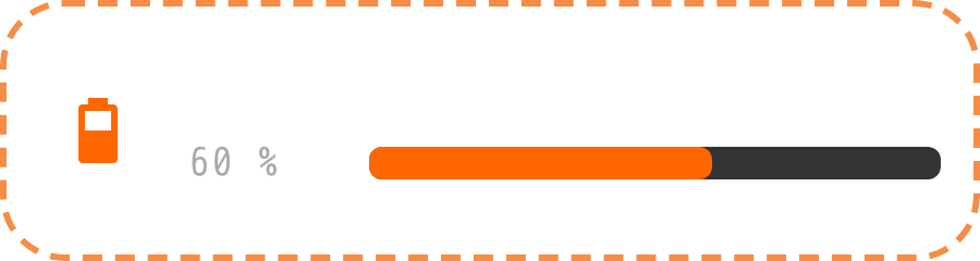
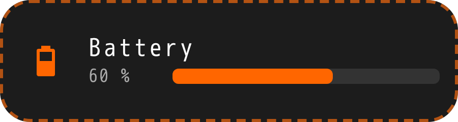
Show YAML
type: custom:entity-progress-card
entity: sensor.battery
card_mod: # or: uix:
  style: |
    ha-card {
      --epb-card-height: 80px;
      --epb-card-width: 300px;

      --epb-card-border-width: 2px;
      --epb-card-border-color: #ff6600;
      --epb-card-border-radius: 20px;
      --epb-card-border-style: dashed;

      --epb-progress-bar-color: #ff6600;
      --epb-progress-bar-background-color: #333333;
      --epb-icon-and-shape-color: #ff6600;
      --epb-low-watermark-color: #ff0000;
      --epb-high-watermark-color: #00ff00;
      --epb-watermark-opacity: 0.5;
      --epb-watermark-line-size: 3px;
      --epb-zero-mark-width: 2px;

      --epb-progress-bar-size: 60%;
      --epb-progress-bar-radius: 4px;
      --epb-progress-inner-radius: 4px;

      --epb-card-font-family: monospace;
      --epb-name-color: #ffffff;
      --epb-name-font-size: 16px;
      --epb-name-font-weight: 700;
      --epb-name-letter-spacing: 2px;

      --epb-detail-color: #aaaaaa;
      --epb-detail-font-size: 12px;
      --epb-detail-font-weight: 300;
      --epb-detail-letter-spacing: 1px;
    }
CSS hooks
Card
| Variable | Description | Example |
|---|---|---|
--epb-card-height |
Card height | 80px |
--epb-card-width |
Card width | 300px |
--epb-card-border-width |
Border thickness | 2px |
--epb-card-border-color |
Border color | #ff6600 |
--epb-card-border-radius |
Card corner radius | 20px |
--epb-card-border-style |
Border style | dashed |
--epb-card-font-family |
Card font family | monospace |
--epb-spacing |
Global density: paddings and gaps of the whole card | 6px |
Icon
| Variable | Description | Example |
|---|---|---|
--epb-icon-size |
Icon size (standard card layout) | 28px |
--epb-shape-size |
Circular shape size behind the icon | 42px |
--epb-icon-and-shape-color |
Icon and shape background color, both at once | #ff6600 |
--epb-icon-color |
Icon color only, overrides --epb-icon-and-shape-color for just the icon |
#ff6600 |
--epb-icon-shape-color |
Shape background color only, overrides --epb-icon-and-shape-color for just the shape |
#ff6600 |
--epb-icon-shape-hover-color |
Shape background color on hover, for a clickable icon — settable from a theme, no card_mod needed |
#ff6600 |
--epb-icon-shape-opacity |
Circular shape opacity behind the icon (0 removes it entirely, new in 1.6.2) |
0 |
--epb-charge-x1 |
icon_animation: battery_charging bolt left edge |
34% |
--epb-charge-x2 |
icon_animation: battery_charging bolt right edge |
67% |
--epb-charge-y1 |
icon_animation: battery_charging bolt top edge |
29% |
Progress Bar
| Variable | Description | Example |
|---|---|---|
--epb-progress-transition |
Bar fill transition (duration/easing, none to disable) |
0.2s linear |
--epb-progress-bar-color |
Progress bar fill color | #ff6600 |
--epb-progress-bar-background-color |
Progress bar background color | #333333 |
--epb-progress-bar-size |
Forces the bar fill size (overrides computed value) | 60% |
--epb-progress-bar-radius |
Progress bar container border radius | 4px |
--epb-progress-inner-radius |
Progress bar inner fill border radius | 4px |
--epb-progress-bar-min-width |
Minimum bar width before it stops shrinking further | 30px |
--epb-bar-segment-gap |
bar_segments gap between cells (overrides computed value) |
2px |
--epb-ring-softness |
Inner edge softness of the bar_position: icon ring (bar_ring.softness wins); default 1px |
0px |
Marker
| Variable | Description | Example |
|---|---|---|
--epb-rainbow-marker-color |
bar_color_mode: rainbow_full marker color |
#ffffff |
--epb-rainbow-marker-opacity |
bar_color_mode: rainbow_full marker opacity |
1 |
--epb-rainbow-marker-size |
bar_color_mode: rainbow_full marker width |
5px |
--epb-rainbow-marker-border-color |
bar_color_mode: rainbow_full marker border color |
#ffffff |
--epb-rainbow-marker-border-width |
bar_color_mode: rainbow_full marker border thickness |
1px |
--epb-zero-mark-width |
Zero marker thickness | 2px |
--epb-zero-mark-color |
Zero marker color | #ff0000 |
Name
| Variable | Description | Example |
|---|---|---|
--epb-name-color |
Name color | #ffffff |
--epb-name-font-size |
Name font size | 16px |
--epb-name-font-weight |
Name font weight | 700 |
--epb-name-letter-spacing |
Name letter spacing | 2px |
Text effect
| Variable | Description | Example |
|---|---|---|
--epb-text-effect-color |
text_effect color (default: the card background) |
#000000 |
--epb-text-effect-size |
text_effect thickness |
1px |
--epb-text-effect-blur |
text_effect blur |
2px |
Detail
| Variable | Description | Example |
|---|---|---|
--epb-detail-color |
Detail color | #aaaaaa |
--epb-detail-font-size |
Detail font size | 12px |
--epb-detail-font-weight |
Detail font weight | 300 |
--epb-detail-letter-spacing |
Detail letter spacing | 1px |
--epb-multi-value-width |
Width of the value column of a Multi-Card / Multi-Feature | 120px |
Trend
| Variable | Description | Example |
|---|---|---|
--epb-trend-icon-color |
trend_indicator arrow color, overrides the direction's own computed color |
#ff6600 |
Watermark
| Variable | Description | Example |
|---|---|---|
--epb-watermark-line-size |
Line watermark thickness | 3px |
--epb-watermark-opacity |
Watermark opacity, both sides (overridden per side by the two below) | 0.5 |
--epb-low-watermark-opacity |
Low watermark opacity only | 0.5 |
--epb-high-watermark-opacity |
High watermark opacity only | 0.5 |
--epb-low-watermark-color |
Low watermark color | #ff0000 |
--epb-high-watermark-color |
High watermark color | #00ff00 |
Peak Marker
| Variable | Description | Example |
|---|---|---|
--epb-peak-min-color |
peak_marker minimum mark color |
#00ffff |
--epb-peak-min-opacity |
peak_marker minimum mark opacity |
0.8 |
--epb-peak-max-color |
peak_marker maximum mark color |
#ff00ff |
--epb-peak-max-opacity |
peak_marker maximum mark opacity |
0.8 |
--epb-peak-average-color |
peak_marker average mark color |
#ffff00 |
--epb-peak-average-opacity |
peak_marker average mark opacity |
0.8 |
--epb-peak-marker-line-size |
peak_marker mark line thickness |
2px |
--epb-peak-range-color |
peak_marker min–max range color |
#00ffff |
--epb-peak-range-opacity |
peak_marker min–max range opacity |
0.8 |
Alert
| Variable | Description | Example |
|---|---|---|
--epb-alert-background-opacity |
alert_when.highlight: background tint opacity, browsers below the "Full visual effects" tier only (see Prerequisites) |
0.3 |
--epb-ping-color |
ping ring burst color, shared by alert_when (border and label) and icon_animation: ping |
#ff6600 |
--epb-ping-spread |
ping ring burst reach at the end of the animation |
20px |
Status Label
| Variable | Description | Example |
|---|---|---|
--epb-label-color |
status_label pill text color |
#ffffff |
--epb-label-background-color |
status_label pill background color |
#333333 |
--epb-label-border-color |
status_label pill border color |
#ff6600 |
Icon and shape color
The shape (the circular background behind the icon) has its own opacity,
independent of --epb-icon-and-shape-color/--epb-icon-shape-color — 20% at
rest, 35% on hover for a clickable icon (ha-tile-icon's own numbers). CSS
opacity multiplies with whatever alpha the color itself already carries, so an
rgba(...) shape color and that built-in opacity compose: a
rgba(255, 102, 0, 0.3) shape color actually renders at roughly 0.3 × 20% ≈ 6%
visible opacity at rest, not 30%.
If you're picking the alpha yourself, set --epb-icon-shape-opacity: 1 too so
your rgba() value is the only transparency in effect:
card_mod: # or: uix:
  style: |
    ha-card {
      --epb-icon-shape-color: rgba(255, 102, 0, 0.3);
      --epb-icon-shape-opacity: 1;
    }
Doing that also turns off the built-in hover brighten (20% → 35%), since it's
driven by that same opacity. --epb-icon-shape-hover-color restores a hover
effect for a clickable icon without card_mod — a plain value in your theme
YAML, since a theme can't declare a :hover selector itself:
my_custom_theme:
  # ...
  epb-icon-shape-color: 'rgba(255, 102, 0, 0.3)'
  epb-icon-shape-opacity: 1
  epb-icon-shape-hover-color: 'rgba(255, 102, 0, 0.5)'
The same thing also works from card_mod, scoped to a single card. Its style:
is injected straight into the card's own shadow root, so it can also target
.shape directly if you need a real :hover rule instead — shown in the
DOM tree below:
card_mod: # or: uix:
  style: |
    ha-card {
      --epb-icon-shape-color: rgba(255, 102, 0, 0.3);
      --epb-icon-shape-opacity: 1;
    }
    .shape:hover {
      --epb-icon-shape-color: rgba(255, 102, 0, 0.5);
    }
Note
Unlike the --epb-* variables, .shape is an internal class name, not a
versioned public hook — see the Old class names if
it's ever renamed in a future release.
Card structure (advanced)
You do not need this section for a ready-made theme. Selectors for card_mod /
uix. Prefer the --epb-* variables when one exists: class names can
change between versions.
DOM
Card
ha-card.entity-progress-card...
 ├─ ha-ripple
 ├─ div.container
 │   ├─ div.trend-indicator (optional)
 │   │   └─ ha-icon.trend-icon
 │   ├─ div.icon-section
 │   │   ├─ shape.shape
 │   │   │   ├─ ha-ripple
 │   │   │   └─ div.icon
 │   │   │       └─ ha-state-icon
 │   │   └─ div.badge (optional)
 │   │       └─ ha-icon.badge-icon
 │   └─ div.content-section
 │       ├─ div.name
 │       │   └─ div.ellipsis-wrapper
 │       │       └─ span.name-value
 │       │           ├─ span.name-main
 │       │           └─ span.name-extra (optional)
 │       └─ div.secondary-info
 │           └─ div.secondary-info-wrapper
 │               └─ div.ellipsis-wrapper
 │                   └─ div.secondary-info-value
 │                       ├─ span.secondary-info-extra-1 (optional)
 │                       └─ span.secondary-info-main
 └─ div.top-container / div.bottom-container / div.below-container (depends on barPosition)
     └─ div.bar-container
         └─ div.progress-bar.default / center-zero (depends on bar type)
             ├─ div.inner
             ├─ div.low.watermark.mark.wm-<type>
             ├─ div.high.watermark.mark.wm-<type>
             ├─ div.peak-min.watermark.mark.wm-<type> (Card only)
             ├─ div.peak-max.watermark.mark.wm-<type> (Card only)
             ├─ div.peak-avg.watermark.mark.wm-<type> (Card only)
             └─ div.zero.mark (if center-zero)
Every mark carries its own shape class — wm-blended, wm-area, wm-striped,
wm-line, wm-round or wm-triangle — matching that mark's own
type. One rule per shape styles every mark,
watermark and peak_marker alike.
With multiline: true,
div.secondary-info-wrapper looks like this instead — two independent
single-line boxes rather than one shared line:
div.secondary-info-wrapper
 ├─ div.ellipsis-wrapper.secondary-info-line-1
 │   └─ div.secondary-info-value
 │       └─ span.secondary-info-extra-1
 └─ div.ellipsis-wrapper.secondary-info-line-2
     └─ div.secondary-info-value
         ├─ span.secondary-info-extra-2 (optional)
         └─ span.secondary-info-main
Note
The two multiline lines are sized to fit within the same total height as one
standard line, so their font size and line height are fixed and don't follow
--epb-detail-font-size. Color, weight and letter spacing still do
(--epb-detail-color, --epb-detail-font-weight,
--epb-detail-letter-spacing).
With content_order, div.content-section
holds one div.content-line per line instead:
div.content-section
 ├─ div.content-line.lead (first line; none on a single_line row)
 │   ├─ div.content-group (consecutive texts, one ellipsis)
 │   │   ├─ span.name-main[data-block=name]
 │   │   └─ span.name-extra[data-block=name_info]
 │   └─ div.content-group.value-end (a value closing the line)
 │       └─ span.secondary-info-main[data-block=value]
 └─ div.content-line.with-bar
     ├─ div.content-group
     │   ├─ span.secondary-info-extra-1[data-block=info]
     │   └─ span.secondary-info-state[data-block=state_content]
     └─ div.bar-container
Note
The text variables follow the line, not the item: --epb-name-* style the
first line, --epb-detail-* every other line, whatever they hold.
Template
Show the tree
ha-card...
 ├─ ha-ripple
 ├─ div.container
 │   ├─ div.trend-indicator (optional)
 │   │   └─ ha-icon.trend-icon
 │   ├─ div.icon-section
 │   │   ├─ shape.shape
 │   │   │   ├─ ha-ripple
 │   │   │   └─ div.icon
 │   │   │       └─ ha-state-icon
 │   │   └─ div.badge (optional)
 │   │       └─ ha-icon.badge-icon
 │   └─ div.content-section
 │       ├─ div.name
 │       │   └─ div.ellipsis-wrapper
 │       │       └─ span.name-value
 │       │           ├─ span.name-main
 │       │           └─ span.name-extra (optional)
 │       └─ div.secondary-info
 │           └─ div.secondary-info-wrapper
 │               └─ div.ellipsis-wrapper
 │                   └─ div.secondary-info-value
 │                       └─ span.secondary-info-extra-1
 └─ div.top-container / div.bottom-container / div.below-container (if barPosition)
     └─ div.bar-container
         └─ div.progress-bar.default / center-zero
             ├─ div.inner
             ├─ div.low.watermark.mark.wm-<type>
             ├─ div.high.watermark.mark.wm-<type>
             ├─ div.peak-min.watermark.mark (always present, never shown - peak_marker is Card only)
             ├─ div.peak-max.watermark.mark (always present, never shown - peak_marker is Card only)
             ├─ div.peak-avg.watermark.mark (always present, never shown - peak_marker is Card only)
             └─ div.zero.mark (if center-zero)
With multiline: true,
div.secondary-info-wrapper looks like this instead. Template cards never have
a secondary-info-main span (their value comes through
percent/secondary
instead), so unlike the standard card, line 2 is secondary-info-extra-2 alone:
div.secondary-info-wrapper
 ├─ div.ellipsis-wrapper.secondary-info-line-1
 │   └─ div.secondary-info-value
 │       └─ span.secondary-info-extra-1
 └─ div.ellipsis-wrapper.secondary-info-line-2
     └─ div.secondary-info-value
         └─ span.secondary-info-extra-2
Badge
Show the tree
ha-card...
 ├─ div.container
 │   ├─ div.icon-section
 │   │   └─ shape.shape
 │   │       ├─ ha-ripple
 │   │       └─ div.icon
 │   │           └─ ha-state-icon
 │   └─ div.content-section
 │       ├─ div.name
 │       │   └─ div.ellipsis-wrapper
 │       │       └─ span.name-value
 │       │           ├─ span.name-main
 │       │           └─ span.name-extra (optional)
 │       └─ div.secondary-info
 │           └─ div.secondary-info-wrapper
 │               └─ div.ellipsis-wrapper
 │                   └─ div.secondary-info-value
 │                       ├─ span.secondary-info-extra-1 (optional)
 │                       └─ span.secondary-info-main
multiline is not available on badges — the row is too small for a second line
(see multiline).
Center-Zero / Vertical Bars (Additional Variants)
Show the tree
ha-card...
 ├─ div.container
 │   ├─ div.icon-section
 │   └─ div.content-section
 │       ├─ div.name
 │       │   └─ span.name-value
 │       └─ div.secondary-info
 │           └─ div.secondary-info-value
 └─ div.bar-container.vertical / top / bottom / below
     └─ div.progress-bar.center-zero
         ├─ div.bar-half.negative-zone
         │   └─ div.inner.negative
         ├─ div.bar-half.positive-zone
         │   └─ div.inner.positive
         ├─ div.low.watermark.mark.wm-<type>
         ├─ div.high.watermark.mark.wm-<type>
         ├─ div.peak-min.watermark.mark.wm-<type> (Card only)
         ├─ div.peak-max.watermark.mark.wm-<type> (Card only)
         ├─ div.peak-avg.watermark.mark.wm-<type> (Card only)
         └─ div.zero.mark
Old class names (before v1.6.0)
Classes were renamed in 1.6.0. If a card_mod style stopped working after that version, replace the old names with the new ones:
| Old Class | New Class | Notes / Usage |
|---|---|---|
name-group |
name |
Main container for the name block |
name-combined |
name-value |
Displays the combined main and extra name |
name |
name-main |
Main name text |
name-custom-info |
name-extra |
Extra name info, appended after main name |
secondary-info-detail-group |
secondary-info-wrapper |
Container for secondary info (state/progress/custom) |
secondary-info-detail-combined |
secondary-info-value |
Displays main + extra secondary info — now a <div>, was a <span> |
state-and-progress-info |
secondary-info-main |
Main secondary info (was progress/state) |
secondary-info-custom-info |
secondary-info-extra-1 |
Extra secondary info, line 1 (was custom info) |
| — | secondary-info-extra-2 |
Extra secondary info, line 2 — only exists with multiline: true |
progress-bar-container |
bar-container |
Progress bar wrapper |
progress-bar-inner |
inner |
Single inner bar element (positive/negative unified) |
progress-bar-low-zero |
zero |
Zero mark for center-zero bars |
progress-bar-low-wm |
low |
Low watermark marker |
progress-bar-high-wm |
high |
High watermark marker |
name is both an old name (now name-main) and a new one (was name-group):
rename name to name-main first, then name-group to name.
Card sizing
In most dashboards there is nothing to do: the card sizes itself. Read on only if it looks too tall or too short; the last section has a recipe that shrinks it to its content.
How the card picks its height (technical)
The card adapts to whatever height (or lack of one) its parent gives it. Three CSS layers work together:
getGridOptions()(Card/Template only, not Badge) tells Home Assistant's own Sections grid how many rows to reserve - a plain integer count, not a pixel value. HA turns that into the actual cell size.min-heightis the floor used everywhere that grid reservation doesn't apply (Masonry, embedded in another card) - computed from the exact same row count, translated into Home Assistant's own row-height/gap CSS variables rather than a hardcoded pixel value, so a theme customizing those is followed automatically.heightis100%by default - fills whatever the parent actually gives it.
Both the grid row count and the min-height floor come from the same calculation
(ViewCore.minGridRows in the source):
- 1 row by default (horizontal), 2 for
layout: vertical; - +1 row for
bar_size: xlargeorbar_position: below; - a hidden icon changes the base count only, never the extra row of a large bar (see issue #133);
- 1 row for
layout: verticalwithbar_position: top/bottom/backgroundoncenameandsecondary_infoare both hidden: the bar overlays the icon row, asdensity: compactdoes on that layout.
In a Sections view
Nothing to do: the card takes exactly the height the section reserves for it.
How (technical)
getGridOptions() reserves the right number of rows; the card's own
min-height (see height) reads HA's own
--row-size first, so it lands on the exact same pixel height Sections reserved
for it.
In a Masonry view
Nothing to do in most cases: the card takes its minimum height, and grows if its content needs more room (wrapped text, larger text size).
How (technical)
Masonry doesn't call getGridOptions() at all, and its cards have no explicit
parent height. The card falls back to its min-height floor (the same row-based
calculation above, expressed in real pixels via
--ha-section-grid-row-height/--ha-section-grid-row-gap). If the content
genuinely needs more room than that floor (wrapped text, a larger accessibility
text-size setting), the card grows past it - min-height is a floor, not a
fixed size, precisely so that can happen instead of clipping.
Inside another Lovelace card
An explicit height always wins outright as the
card's exact size, in every container below - it doesn't depend on the card
detecting anything about its surroundings. What actually varies per container is
what happens without an explicit height (does the min-height floor land
on something sensible?), and whether the container gets auto-detected to
drop the card's own frame/background for you (see
frameless) - or you have to set
frameless: true yourself.
| Card | Default sizing (no height set) |
Frameless auto-detected | Notes |
|---|---|---|---|
entities |
Content-sized | Yes | No config needed. |
picture-elements |
Width only | No: set frameless: true |
min_width defaults to 200px; height is not special-cased. |
vertical-stack-in-card |
Masonry-style floor | Yes | Frame dropped as in entities. |
vertical-stack |
Masonry-style floor | No: set frameless: true |
One card per row. |
horizontal-stack |
Reliable in Masonry only | No: set frameless: true |
In Sections it can look shorter than a card placed directly in the section. |
grid |
Depends on square |
No: set frameless: true |
square: true (default) forces square cells, even over height. |
custom:combined-card |
Masonry-style floor | No: set frameless: true |
Behaves like the native stacks it uses inside (catdad-experiments). |
custom:button-card (custom field) |
Content-sized | No: set frameless: true |
See the recipe below (issue #129). |
custom:auto-entities |
Depends on the outer container | Depends on the outer container | Each generated card follows the outer container's rules. |
custom:layout-card (thomasloven) |
Masonry-style floor | No: set frameless: true |
Natural height in every layout mode. |
In grid, square: false behaves like everywhere else: Masonry-style floor
without height, exact size with it. custom:combined-card gets no type-*
class (only card_mod adds them, and not to stack cards), so its frame is never
dropped for you.
Recipe: shrink the card to its content
Same mechanics as Masonry - the card's min-height floor is the effective size
unless the wrapper stretches its children to some ambient height (common with
custom:button-card fields), in which case the card fills that instead, which
can look larger than expected if nothing else on the card needs it (see
issue #129).
For a card that shrinks fully to its content regardless of what the wrapper does, combine:
type: custom:entity-progress-card
height: auto
marginless: true
frameless: true
height: auto- forces content-sized height instead of100%, even where the parent would otherwise stretch it.marginless: true- drops the min-height floor entirely (unset) and removes the card's own padding/margin.frameless: true- drops the border/ background, useful when the wrapper already provides its own frame.
Still stuck? Ask on Discord or open an issue.