Cookbook
Full options, every variant, and the longer real-world recipes — more depth than
the README's quickstart calls for, but useful once you're past
the basics. See configuration.md if you want the
authoritative reference instead (every option, every type, every default,
cross-variant compatibility badges).
Note
New here? Install the card first: see Installation. To use a YAML below, edit your dashboard, add a card, choose Manual, paste the YAML, then Save: nothing changes until you save. Something shows an error? See Troubleshooting. Time left on a washing machine? See The Laundry Mystery.
Variant reference
Which one to use, and how to configure it once you've picked: an overview to
help you decide, then options, defaults, and quick examples. One chapter per
variant after the overview (Multi-Card and Multi-Feature share one), same
structure throughout: Options, Getting Started, and for the Card and the
Card Template, Recipes linking out to the walkthroughs below.
Entity Progress Components
Component Overview
| Component | Description |
|---|---|
| Entity Progress Card | A simple card displaying a progress bar for a single entity. |
| Entity Progress Card Template | A more advanced version with full Jinja templating support. |
| Entity Progress Badge | A compact badge with a mini progress bar. |
| Entity Progress Badge Template | A templatable badge version for advanced use cases. |
| Entity Progress Tile Feature | A native tile feature embedding a progress bar in a Tile card. |
| Entity Progress Multi-Card / Multi-Feature | Stacks several progress bars into a single card or Tile feature. |
Each component is suited for different use cases, depending on display needs, complexity, and UI layout.
Purpose & Use Cases
Entity Progress Card
This card is ideal when:
- You want to display the progress of a single entity (e.g., battery level, completion percentage, charging status).
- You want easy visual representation with minimal configuration.
- You want to enable quick interactions via tap_action, hold_action, or double_tap_action.
Examples:
- Show a vacuum cleaner's cleaning progress.
- Display remaining battery percentage for a device.
- Monitor the progress of a running script or automation.
When to Use the Template Version?
Use the Template version (card or badge) when:
- You need to calculate the percentage manually from multiple sensor values (e.g., water tank level from height readings).
- Your use case involves conditional logic, math, or non-linear scales.
- You want to use Jinja2 templates (Home Assistant's template language, the one of Settings ➡️ Tools ➡️ Template) directly in the YAML, without creating extra helpers (Settings ➡️ Devices & services ➡️ Helpers) or sensors. Not available in a Multi-Card row: stack Template cards instead.
- You need maximum flexibility without being restricted by the standard options.
If you don't write templates, use the standard card.
Examples:
- Calculate energy usage progress from a total daily quota.
- Dynamically adjust color or shape based on a formula.
- Show remaining laundry time based on a template sensor.
Badge vs. Card – Which One?
| Use a Card when… | Use a Badge when… |
|---|---|
| You want rich layout and interactivity | Space is limited (e.g., header views) |
| You need to show actions, icons, and text | You just need quick-glance visuals |
| You rely on theme integration and animations | You want to embed progress in compact form |
Entity Progress Card
The one you'll reach for by default: one entity, one bar, zero surprises. Drop it in, and it already knows what to show — right unit, right icon, right math, no config needed to get something useful on screen.
Best for: tap/hold/double-tap actions, theme-driven colors, and every visual effect (shimmer, rainbow, alerts, watermarks…) without touching a template. Use it for a vacuum's cleaning progress, a device's remaining battery, or any sensor whose percentage Home Assistant can already work out on its own.
Options
Show options
| Option | Type | Default | Description | Link |
|---|---|---|---|---|
| Data Options | ||||
entity |
string (required) | — | Main entity ID | Config Ref. |
attribute |
string (optional) | depends on entity | Attribute to use as value | Config Ref. |
name |
string (optional) | entity name | Custom name to show | Config Ref. |
unit |
string (optional) | auto |
Unit displayed | Config Ref. |
decimal |
integer (optional) | context-based | Number of decimal places | Config Ref. |
min_value |
float/Map (optional) | 0 or -100 |
Min for progress calculation | Config Ref. |
max_value |
float/Map (optional) | 100 |
Max for progress calculation | Config Ref. |
reverse |
boolean (optional) | depends on entity | Countdown-style behavior | Config Ref. |
state_content |
string/list (optional) | depends on domain | Attribute to show near value | Config Ref. |
custom_info |
Jinja (optional) | — | Extra info near value | Config Ref. |
multiline |
boolean (optional) | false |
Split secondary text on 2 lines | Config Ref. |
content_order |
list (optional) | layout's own | Order of name, infos, value and bar | Config Ref. |
name_info |
Jinja (optional) | — | Extra info near name | Config Ref. |
bar_stack |
Map (optional) | — | Combine several entities in one bar | Config Ref. |
| Styling Options | ||||
icon |
string (optional) | — | Icon override | Config Ref. |
color |
string (optional) | based on entity | Icon color | Config Ref. |
icon_animation |
string (optional) | none |
Animate icon on active state | Config Ref. |
badge_icon |
Jinja (optional) | — | Dynamic badge icon | Config Ref. |
badge_color |
Jinja (optional) | — | Dynamic badge color | Config Ref. |
bar_color |
string (optional) | var(--state-icon-color) |
Color of progress bar | Config Ref. |
bar_size |
string (optional) | small |
Size of the progress bar | Config Ref. |
bar_position |
string (optional) | default |
Position of the progress bar | Config Ref. |
bar_single_line |
boolean (optional) | false |
single-line mode for overlay bars | Config Ref. |
bar_segments |
integer (optional) | — | Render bar as discrete segments | Config Ref. |
bar_ring |
object (optional) | — | Start, gap and edge of the ring | Config Ref. |
bar_effect |
string/list/jinja | — | Visual effects for the bar | Config Ref. |
bar_color_mode |
string (optional) | auto |
Bar fill color rendering mode | Config Ref. |
bar_scale |
string (optional) | linear |
Value-to-width mapping (linear/log) | Config Ref. |
bar_max_width |
string (optional) | - | Limits the maximum width of the bar | Config Ref. |
bar_aligned |
boolean/string (optional) | false |
Bars start at the same x | Config Ref. |
bar_orientation |
string (optional) | ltr |
Bar direction | Config Ref. |
force_circular_background |
boolean (optional) | false |
Force icon circle background | Config Ref. |
trend_indicator |
string (optional) | false |
Displays trend icons. | Config Ref. |
peak_marker |
Map (optional) | — | Min/max/average marks from history | Config Ref. |
status_label |
string/Map (optional) | — | Status pill on the card | Config Ref. |
text_effect |
string (optional) | none |
Text readability effect (overlay) | Config Ref. |
density |
string (optional) | default |
Smaller footprint preset | Config Ref. |
layout |
string (optional) | horizontal |
Layout direction | Config Ref. |
frameless |
boolean (optional) | false |
Remove card frame | Config Ref. |
marginless |
boolean (optional) | false |
Remove top/bottom margin | Config Ref. |
height |
string (optional) | — | Card height | Config Ref. |
min_width |
string (optional) | — | Minimum width | Config Ref. |
reverse_secondary_info_row |
boolean (optional) | false |
Flip info bar layout | Config Ref. |
unit_spacing |
string (optional) | auto |
Controls space between value and unit | Config Ref. |
unit_position |
string (optional) | after |
Unit before or after the value | Config Ref. |
value_compact |
boolean (optional) | false |
Shorten large values (1.2 kW) | Config Ref. |
value_sign |
boolean (optional) | false |
Always show the +/- sign | Config Ref. |
center_zero |
boolean (optional) | false |
Center the bar on 0 | Config Ref. |
theme |
string (optional) | — | Applies a preset theme | Config Ref. |
custom_theme |
list (optional) | — | Define color thresholds | Config Ref. |
interpolate |
boolean (optional) | — | Enables smooth color transition | Config Ref. |
hide |
list (optional) | — | Hide parts of the card | Config Ref. |
watermark |
map (optional) | — | Adds min/max overlays | Config Ref. |
alert_when |
map (optional) | — | Highlight card on threshold crossing | Config Ref. |
| Behavior And Actions | ||||
xyz_action |
map (optional) | see defaults | Tap/double/hold actions | Config Ref. |
See Full Configuration Reference.
Percentage calculation: Timer entities take min/max/current directly from
the timer (no attribute). Counter/Number entities use the entity's own
value/min/max (max_value can still override). Any other numeric entity is
treated as the current value, with min/max from 0/100, config, or an
external entity via max_value.
Getting Started
Tip
Use Material Design Icons (MDI) for a consistent look. Browse available icons at Material Design Icons. Experiment with color codes like HEX or RGB for precise customization. Combine with other Lovelace cards to create a visually cohesive dashboard.
Important
Some examples below highlight interoperability with other popular Home Assistant projects. To replicate them, install these custom cards from HACS (only for the examples that use them):
Basic usage:
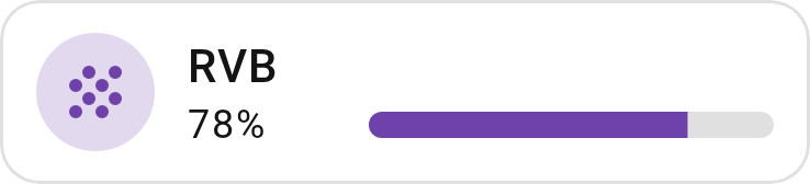
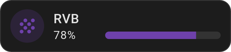
Show YAML
type: custom:entity-progress-card
entity: sensor.hp_envy_6400_series_tri_color_cartridge
name: RVB
icon: mdi:grain
color: rgb(110, 65, 171)
bar_color: rgb(110, 65, 171)
icon_tap_action:
  action: more-info
A pulsing alert on threshold — the card reacts on its own, no template needed:
Show YAML
type: custom:entity-progress-card
entity: sensor.disk_usage
name: Disk Usage
icon: mdi:harddisk
theme: critical_when_high
alert_when:
  above: 80
  color: red
  highlight: border
  animation: ping
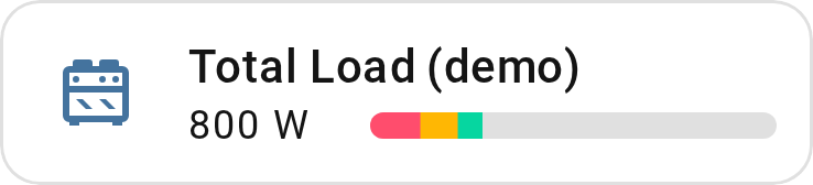
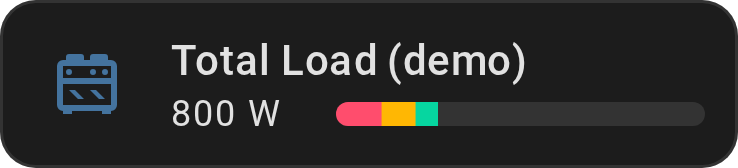
Three circuits, one bar — combine several sensors toward one shared target
with bar_stack:
Show YAML
type: custom:entity-progress-card
entity: sensor.circuit_kitchen_power
name: Total Load
max_value: 3000
decimal: 0
bar_color: '#FF4D6D'
bar_stack:
  mode: proportional
  entities:
    - entity: sensor.circuit_living_room_power
      color: '#FFB703'
    - entity: sensor.circuit_garage_power
      color: '#06D6A0'
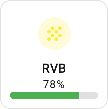
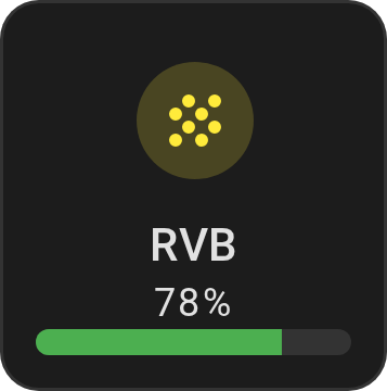
Grid option and vertical layout:
Show YAML
type: custom:entity-progress-card
entity: sensor.hp_envy_6400_series_tri_color_cartridge
name: RVB
icon: mdi:grain
color: yellow
bar_color: green
icon_tap_action:
  action: more-info
layout: vertical
grid_options:
  columns: 3
  rows: 2
Battery dashboard, leveraging theme capabilities and auto-entities:
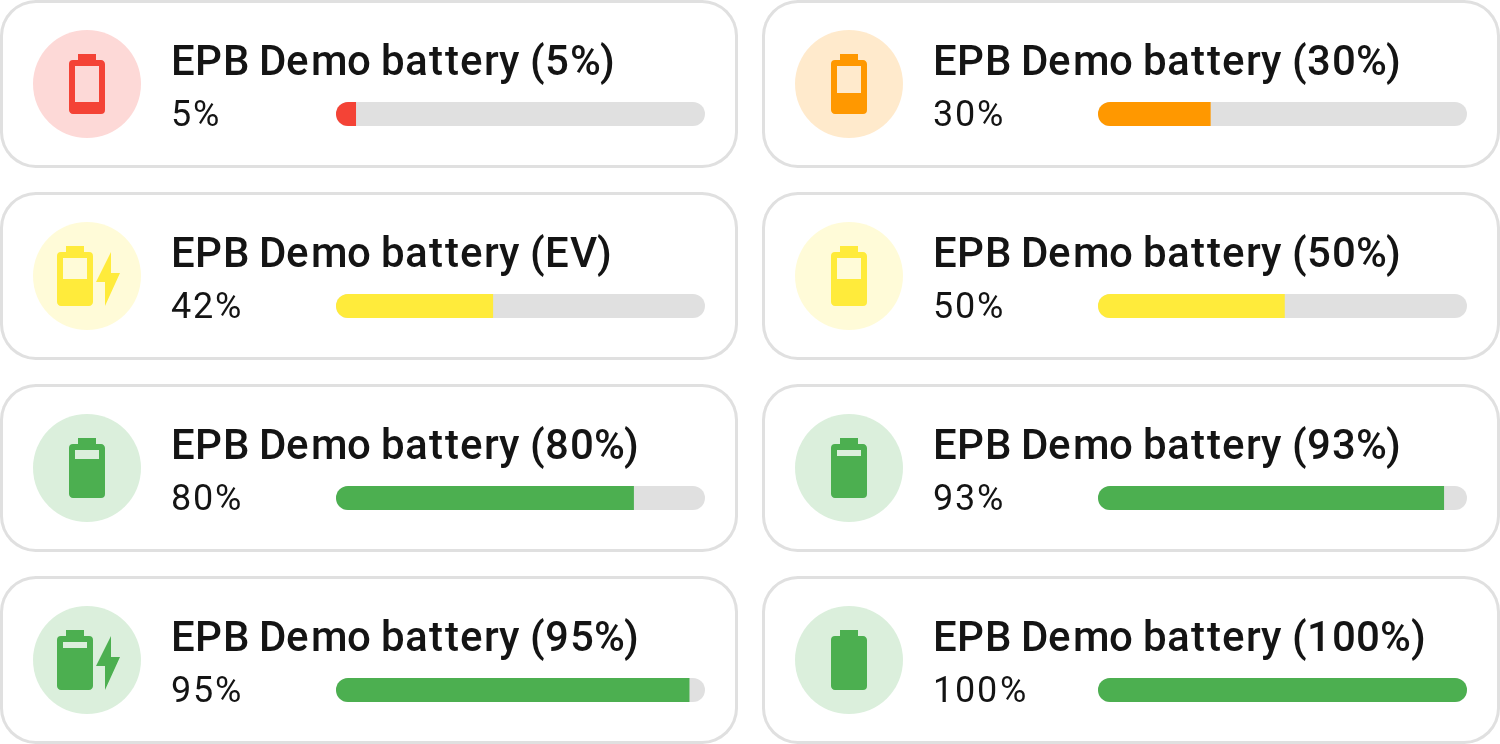
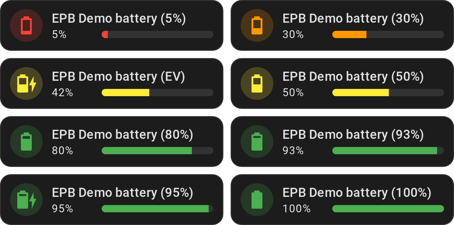
Show YAML
type: custom:auto-entities
filter:
  include:
    - attributes:
        device_class: battery
      options:
        type: custom:entity-progress-card
        entity: this.entity_id # remove this line with auto-entities v1.14.1+
        theme: optimal_when_high
        icon_tap_action:
          action: more-info
card:
  square: false
  type: grid
  columns: 2
show_empty: true
card_param: cards
sort:
  method: state
  numeric: true
  ignore_case: false
Litter box — a percentage based on a minimum and maximum quantity:
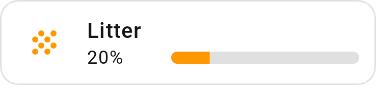
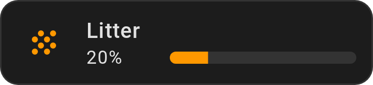
Show YAML
type: custom:entity-progress-card
entity: sensor.petkit_puramax_2_poids_litiere
min_value: 6
max_value: 12
name: Litter
theme: optimal_when_high
grid_options:
  columns: 6
  rows: 1
card_mod / animation — dynamic animations on the icon:
Show YAML
type: custom:entity-progress-card
entity: sensor.hp_envy_6400_series_tri_color_cartridge
name: RVB
icon: mdi:grain
color: rgb(110, 65, 171)
bar_color: rgb(110, 65, 171)
card_mod:
  style: |-
    .icon {
      animation: boing 3s ease infinite;
      transform-origin: 50% 90%;
    }
    @keyframes boing {
      0% { transform: scale3d(1, 1, 1); }
      7% { transform: scale3d(1.25, 0.75, 1); }
      10% { transform: scale3d(0.75, 1.25, 1); }
      12% { transform: scale3d(1.15, 0.85, 1); }
      16% { transform: scale3d(0.95, 1.05, 1); }
      19% { transform: scale3d(1.05, 0.95, 1); }
      25% { transform: scale3d(1, 1, 1); }
    }
Tip
We expose the .icon and .shape to properly animate the card.
vertical-stack-in-card — group multiple cards into a cohesive layout,
combined with auto-entities for dynamic listing and
frameless to strip borders and shadows:
Show YAML
type: custom:vertical-stack-in-card
cards:
  - type: custom:auto-entities
    filter:
      include:
        - attributes:
            device_class: battery
          options:
            type: custom:entity-progress-card
            entity: this.entity_id # remove this line with auto-entities v1.14.1+
            theme: battery_adaptive
            bar_color_mode: rainbow
            icon_animation: battery_charging
            icon_tap_action:
              action: more-info
            frameless: true
    sort:
      method: state
      numeric: true
      ignore_case: false
    card:
      square: false
      type: grid
      columns: 2
    card_param: cards
Native vertical-stack - no custom card needed, just a tile and an
entity-progress-card on the same entity in one block:
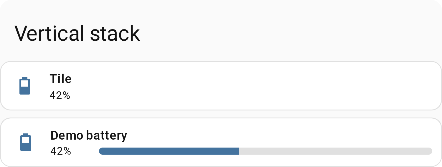
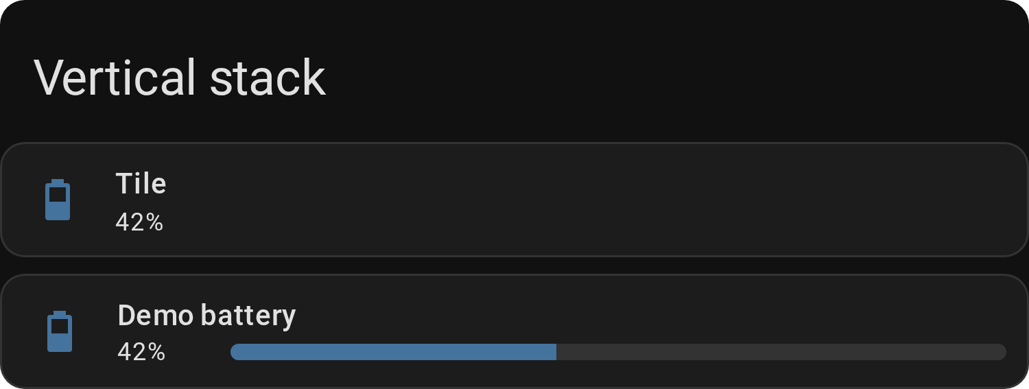
Show YAML
type: vertical-stack
cards:
  - type: tile
    entity: sensor.xyz
    name: Tile
    vertical: false
    features_position: bottom
  - type: custom:entity-progress-card
    entity: sensor.xyz
    layout: horizontal
    bar_size: small
Native entities - drop it in as one row among regular entities, no wrapper
needed:
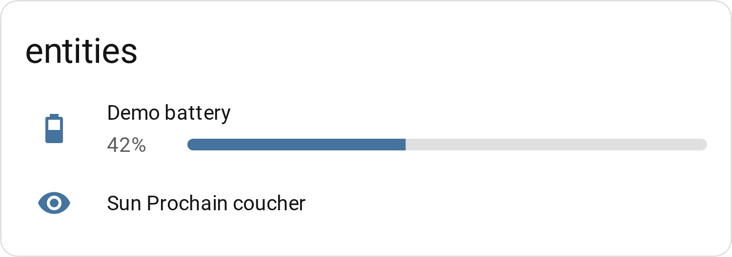
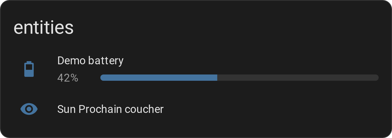
Show YAML
type: entities
title: entities
entities:
  - type: custom:entity-progress-card
    entity: sensor.xyz
    layout: horizontal
    bar_size: small
  - entity: sensor.abc
Tip
height wins outright inside any of these containers - set it explicitly
(e.g. height: 100px) to break out of the container's own sizing.
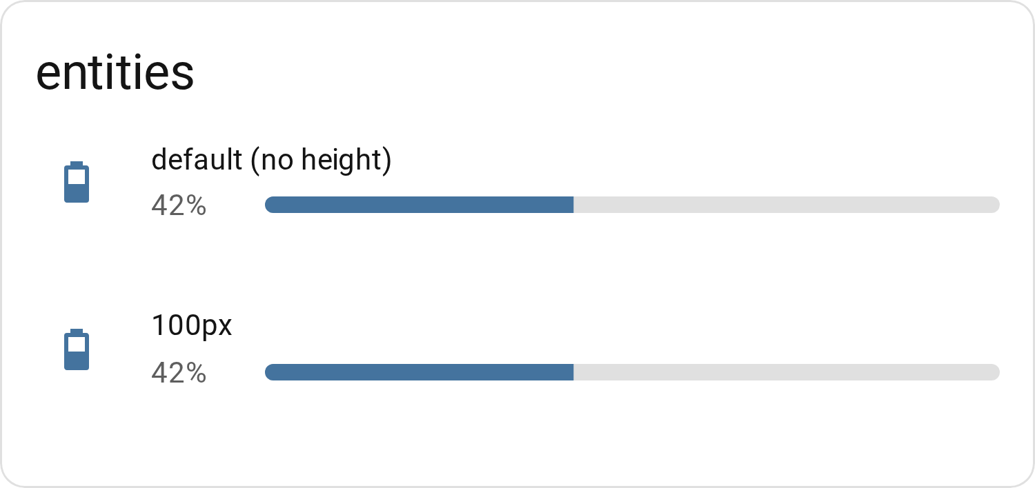
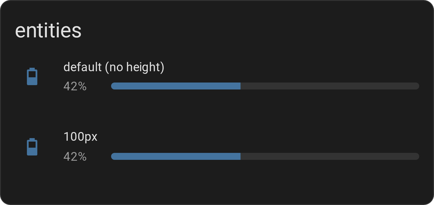
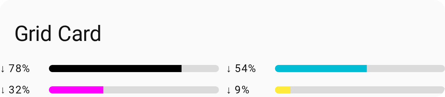
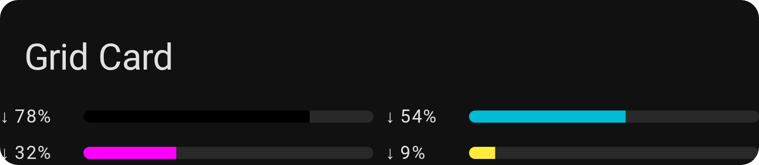
Native grid - marginless/frameless fuse the cells into a single
seamless block:
Show YAML
type: grid
square: false
columns: 2
title: Grid Card
cards:
  - type: custom:entity-progress-card
    entity: sensor.ink_black
    bar_color: black
    hide:
      - name
      - icon
    marginless: true
    frameless: true
    height: auto
  - type: custom:entity-progress-card
    entity: sensor.ink_cyan
    bar_color: cyan
    hide:
      - name
      - icon
    marginless: true
    frameless: true
    height: auto
Recipes
Real-world setups that go beyond a quick config — brand-specific washing machine quirks, deriving a percentage from a start/end time via a Helper, an SSL certificate expiry countdown:
- 🧺 The Laundry Mystery: Decoding Washer Entities Across Brands
- 🌀 Washing Machine Progress: Three Brands, Three Approaches
- 🧮 Cracking a Complex Case with a Simple Helper
- 🔒 Don't Let It Expire! (SSL Certificate Countdown)
Entity Progress Card Template
When the base Card's math doesn't cover your case — multi-sensor formulas, non-linear scales, conditional colors — this is where you drop into Jinja and take over.
Best for: every field (name, percent, bar_color, icon…) becomes its own
template, so nothing is off-limits. Use it for a water tank's level computed
from a height sensor, a laundry cycle's remaining time derived from a template
sensor, or any percentage that needs conditional logic instead of a fixed
min/max.
Note
The keyword entity can be used in Jinja to represent the entity defined at
the card level.
Options
Show options
| Option | Type | Default | Description | Link |
|---|---|---|---|---|
| Data Options | ||||
entity |
string (optional) | — | Entity ID. | Config Ref. |
fast_refresh |
boolean (optional) | false |
Refresh now() templates every second |
Config Ref. |
| Jinja Options | ||||
name |
Jinja (optional) | — | Renders the customized entity name | Config Ref. |
icon |
Jinja (optional) | — | Main icon shown on the card | Config Ref. |
secondary |
Jinja (optional) | — | Renders the secondary content (e.g., unit, status, additional info) | Config Ref. |
percent |
Jinja (optional) | — | Numerical value representing progress (0–100%), affects progress bar width | Config Ref. |
color |
Jinja (optional) | — | Dynamic color for the icon and shape: a color name or any CSS color | Config Ref. |
bar_color |
Jinja (optional) | — | Dynamic progress bar color: a color name or any CSS color | Config Ref. |
| Styling Options | ||||
badge_icon |
Jinja (optional) | — | Dynamic badge icon | Config Ref. |
badge_color |
Jinja (optional) | — | Dynamic badge color | Config Ref. |
bar_size |
string (optional) | small |
Customize the size or thickness of the progress bar. | Config Ref. |
bar_position |
string (optional) | default |
Position of the progress bar | Config Ref. |
bar_single_line |
boolean (optional) | false |
single-line mode for overlay bars | Config Ref. |
bar_segments |
integer (optional) | — | Render bar as discrete segments | Config Ref. |
bar_ring |
object (optional) | — | Start, gap and edge of the ring | Config Ref. |
bar_effect |
string/list/Jinja (optional) | — | Visual effects for the bar | Config Ref. |
bar_color_mode |
string (optional) | auto |
Bar fill color rendering mode | Config Ref. |
bar_max_width |
string (optional) | - | Limits the maximum width of the bar | Config Ref. |
bar_aligned |
boolean/string (optional) | false |
Lines the bar up with the cards sharing its group name | Config Ref. |
bar_orientation |
string (optional) | ltr |
Define the direction of the progress bar (e.g., ltr, rtl). |
Config Ref. |
icon_animation |
string (optional) | none |
Animate icon on active state | Config Ref. |
force_circular_background |
boolean (optional) | false |
Force icon circle background. | Config Ref. |
trend_indicator |
string (optional) | false |
Displays trend icons. | Config Ref. |
status_label |
string/Map (optional) | — | Status pill on the card | Config Ref. |
text_effect |
string (optional) | none |
Text readability effect (shadow, halo, outline, plate, contrast). |
Config Ref. |
density |
string (optional) | default |
Smaller footprint preset (default, compact, single_line). |
Config Ref. |
layout |
string (optional) | horizontal |
Adjust the overall layout (e.g., horizontal, vertical). |
Config Ref. |
frameless |
boolean (optional) | false |
Remove the default card border and background for a seamless, flat appearance. | Config Ref. |
marginless |
boolean (optional) | false |
Remove vertical margin for a more compact template display. | Config Ref. |
height |
string (optional) | — | Card height | Config Ref. |
min_width |
string (optional) | — | Set a minimum width for the template to ensure consistent layout. | Config Ref. |
reverse_secondary_info_row |
boolean (optional) | false |
Flip info bar layout. | Config Ref. |
multiline |
boolean (optional) | false |
Split secondary text on 2 lines. | Config Ref. |
content_order |
list (optional) | layout's own | Place name, name_info, info, state_content, value and bar on lines. | Config Ref. |
center_zero |
boolean (optional) | false |
Center the bar on 0. | Config Ref. |
theme |
string (optional) | — | Applies a preset theme | Config Ref. |
hide |
list (optional) | — | Hide parts of the card. | Config Ref. |
watermark |
map (optional) | — | Adds min/max overlays. | Config Ref. |
alert_when |
map (optional) | — | Highlight card on threshold crossing | Config Ref. |
| Behavior & Actions | ||||
xyz_action |
map (optional) | see defaults | Configure custom actions (e.g., tap, hold, etc.). |
Config Ref. |
See Full Configuration Reference.
Getting Started
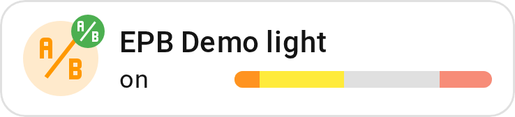
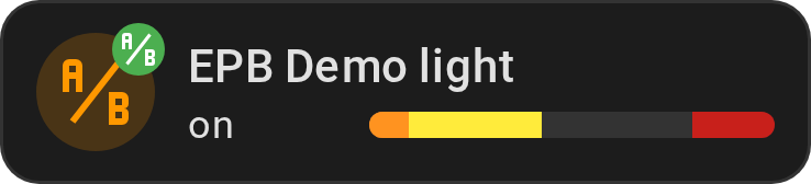
Show YAML
type: custom:entity-progress-card-template
entity: light.led0
icon: |-
  {% if states('light.led0') == 'on' %}
    mdi:ab-testing
  {% else %}
    mdi:abacus
  {% endif %}
name: "{{ state_attr('light.led0', 'friendly_name') }}"
secondary: "{{ states('light.led0') }}"
badge_icon: |-
  {% if states('light.led0') == 'on' %}
    mdi:ab-testing
  {% else %}
    mdi:library
  {% endif %}
badge_color: |-
  {% if states('light.led0') == 'on' %}
    green
  {% else %}
    grey
  {% endif %}
percent: |-
  {% if states('light.led0') == 'on' %}
    {{ (state_attr('light.led0', 'brightness') | float * 100 / 255) | round(2) }}
  {% else %}
    0
  {% endif %}
color: |-
  {% if states('light.led0') == 'on' %}
    orange
  {% else %}
    grey
  {% endif %}
bar_color: |-
  {% if states('light.led0') == 'on' %}
    yellow
  {% else %}
    red
  {% endif %}
watermark:
  low: 10
tap_action:
  action: navigate
  navigation_path: /config
Recipes
A dynamic sun-tracking bar — progress toward the next sunrise/sunset, live countdown, color that flips with the horizon — entirely computed in Jinja:
Entity Progress Badge
The Card, shrunk to fit a header row — same read at a glance, a fraction of the space.
Best for: dashboard headers, sidebars, and anywhere a full card would crowd the layout. Use it for a quick battery or Wi-Fi glance sitting next to your view's other badges, not as the dashboard's main focus.
Options
Show options
| Option | Type | Default | Description | Link |
|---|---|---|---|---|
| Data Options | ||||
entity |
string (required) | — | Main entity ID | Config Ref. |
attribute |
string (optional) | depends on entity | Attribute to use as value | Config Ref. |
name |
string (optional) | entity name | Custom name to show | Config Ref. |
unit |
string (optional) | auto |
Unit displayed | Config Ref. |
decimal |
integer (optional) | context-based | Number of decimal places | Config Ref. |
min_value |
float/Map (optional) | 0 or -100 |
Min for progress calculation | Config Ref. |
max_value |
float/Map (optional) | 100 |
Max for progress calculation | Config Ref. |
reverse |
boolean (optional) | depends on entity | Countdown-style behavior | Config Ref. |
state_content |
string/list (optional) | depends on domain | Attribute to show near value | Config Ref. |
custom_info |
Jinja (optional) | — | Extra info near value | Config Ref. |
name_info |
Jinja (optional) | — | Extra info near name | Config Ref. |
bar_stack |
Map (optional) | — | Combine several entities in one bar | Config Ref. |
| Styling Options | ||||
icon |
string (optional) | — | Icon override | Config Ref. |
color |
string (optional) | based on entity | Icon color | Config Ref. |
bar_color |
string (optional) | var(--state-icon-color) |
Color of progress bar | Config Ref. |
bar_size |
string (optional) | small |
Size of the progress bar | Config Ref. |
bar_position |
string (optional) | default |
Bar under the text or around the icon | Config Ref. |
bar_segments |
integer (optional) | — | Render bar as discrete segments | Config Ref. |
bar_ring |
object (optional) | — | Start, gap and edge of the ring | Config Ref. |
bar_effect |
string/list/jinja | — | Visual effects for the bar | Config Ref. |
bar_color_mode |
string (optional) | auto |
Bar fill color rendering mode | Config Ref. |
bar_scale |
string (optional) | linear |
Value-to-width mapping (linear/log) | Config Ref. |
bar_orientation |
string (optional) | ltr |
Bar direction | Config Ref. |
frameless |
boolean (optional) | false |
Remove card frame | Config Ref. |
marginless |
boolean (optional) | false |
Remove top/bottom margin | Config Ref. |
min_width |
string (optional) | — | Minimum width | Config Ref. |
reverse_secondary_info_row |
boolean (optional) | false |
Flip info bar layout | Config Ref. |
unit_spacing |
string (optional) | auto |
Controls space between value and unit | Config Ref. |
unit_position |
string (optional) | after |
Unit before or after the value | Config Ref. |
value_compact |
boolean (optional) | false |
Shorten large values (1.2 kW) | Config Ref. |
value_sign |
boolean (optional) | false |
Always show the +/- sign | Config Ref. |
center_zero |
boolean (optional) | false |
Center the bar on 0 | Config Ref. |
theme |
string (optional) | — | Applies a preset theme | Config Ref. |
custom_theme |
list (optional) | — | Define color thresholds | Config Ref. |
interpolate |
boolean (optional) | — | Enables smooth color transition | Config Ref. |
hide |
list (optional) | — | Hide parts of the card | Config Ref. |
watermark |
map (optional) | — | Adds min/max overlays | Config Ref. |
alert_when |
map (optional) | — | Highlight card on threshold crossing | Config Ref. |
| Behavior And Actions | ||||
xyz_action |
map (optional) | see defaults | Tap/double/hold actions | Config Ref. |
See Full Configuration Reference. We use the same syntax as the card.
Getting Started
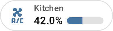
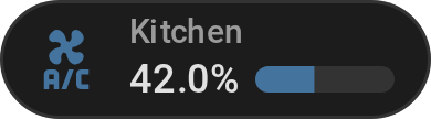
Show YAML
type: custom:entity-progress-badge
entity: sensor.xyz
name: Kitchen
decimal: 1
icon: mdi:air-conditioner
With a theme and a bar effect — same idea, dressed up for a header view:
Show YAML
type: custom:entity-progress-badge
entity: sensor.living_room_battery
theme: optimal_when_high
bar_effect: shimmer
Entity Progress Badge Template
Same shrink, but Jinja-powered end to end — for when a badge needs the same custom math as the Card Template.
Best for: the same conditional logic and multi-sensor formulas as the Card Template, at badge size. Use it when a header row needs a computed percentage — a tank level, a custom quota — instead of a value Home Assistant already exposes directly.
Note
The keyword entity can be used in Jinja to represent the entity defined at
the card level.
Options
Show options
| Option | Type | Default | Description | Link |
|---|---|---|---|---|
| Data Options | ||||
entity |
string (optional) | — | Entity ID. | Config Ref. |
fast_refresh |
boolean (optional) | false |
Refresh now() templates every second |
Config Ref. |
| Jinja Options | ||||
name |
Jinja (optional) | — | Renders the customized entity name | Config Ref. |
icon |
Jinja (optional) | — | Main icon shown on the card | Config Ref. |
secondary |
Jinja (optional) | — | Renders the secondary content (e.g., unit, status, additional info) | Config Ref. |
percent |
Jinja (optional) | — | Numerical value representing progress (0–100%), affects progress bar width | Config Ref. |
color |
Jinja (optional) | — | Dynamic color for the icon and shape: a color name or any CSS color | Config Ref. |
bar_color |
Jinja (optional) | — | Dynamic progress bar color: a color name or any CSS color | Config Ref. |
| Styling Options | ||||
bar_size |
string (optional) | small |
Customize the size or thickness of the progress bar. | Config Ref. |
bar_position |
string (optional) | default |
Bar under the text or around the icon | Config Ref. |
bar_segments |
integer (optional) | — | Render bar as discrete segments | Config Ref. |
bar_ring |
object (optional) | — | Start, gap and edge of the ring | Config Ref. |
bar_effect |
string/list/Jinja (optional) | — | Visual effects for the bar | Config Ref. |
bar_color_mode |
string (optional) | auto |
Bar fill color rendering mode | Config Ref. |
bar_orientation |
string (optional) | ltr |
Define the direction of the progress bar (e.g., ltr, rtl). |
Config Ref. |
frameless |
boolean (optional) | false |
Remove the default card border and background for a seamless, flat appearance. | Config Ref. |
marginless |
boolean (optional) | false |
Remove vertical margin for a more compact template display. | Config Ref. |
min_width |
string (optional) | — | Set a minimum width for the template to ensure consistent layout. | Config Ref. |
reverse_secondary_info_row |
boolean (optional) | false |
Flip info bar layout. | Config Ref. |
center_zero |
boolean (optional) | false |
Center the bar on 0. | Config Ref. |
theme |
string (optional) | — | Applies a preset theme | Config Ref. |
hide |
list (optional) | — | Hide parts of the card. | Config Ref. |
watermark |
map (optional) | — | Adds min/max overlays. | Config Ref. |
alert_when |
map (optional) | — | Highlight card on threshold crossing | Config Ref. |
| Behavior & Actions | ||||
xyz_action |
map (optional) | see defaults | Configure custom actions (e.g., tap, hold, etc.). |
Config Ref. |
See Full Configuration Reference.
Getting Started
Show YAML
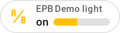
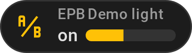
type: custom:entity-progress-badge-template
entity: light.led0
icon: |-
  {% if states('light.led0') == 'on' %}
    mdi:ab-testing
  {% else %}
    mdi:abacus
  {% endif %}
name: "{{ state_attr('light.led0', 'friendly_name') }}"
secondary: "{{ states('light.led0') }}"
percent: |-
  {% if states('light.led0') == 'on' %}
    {{ (state_attr('light.led0', 'brightness') | float * 100 / 255) | round(2) }}
  {% else %}
    0
  {% endif %}
Color escalation — three-way severity, computed entirely in Jinja:
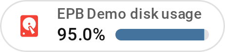
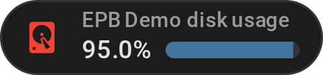
Show YAML
type: custom:entity-progress-badge-template
entity: sensor.disk_usage
icon: mdi:harddisk
name: "{{ state_attr('sensor.disk_usage', 'friendly_name') }}"
secondary: "{{ states('sensor.disk_usage') }}%"
percent: "{{ states('sensor.disk_usage') | float(0) }}"
color: |-
  {% set v = states('sensor.disk_usage') | float(0) %}
  {% if v > 90 %}
    red
  {% elif v > 75 %}
    orange
  {% else %}
    green
  {% endif %}
Entity Progress Tile Feature
The Entity Progress Tile Feature (entity-progress-feature) embeds a
progress bar directly inside a standard Home Assistant Tile card. It renders
as a native feature row and supports overlay positions (top, bottom) that
anchor the bar to the card edge without increasing the tile height.
Best for: staying inside the Tile card's own layout — its icon, its name, its tap actions — instead of adding a second card next to it. Use it when a Tile already shows the entity you care about and just needs a progress row bolted on, not a replacement.
Options
Show options
| Option | Type | Default | Description | Link |
|---|---|---|---|---|
| Data Options | ||||
entity |
string (required) | — | Main entity ID | Config Ref. |
attribute |
string (optional) | depends on entity | Attribute to use as value | Config Ref. |
min_value |
float/Map (optional) | 0 |
Min for progress calculation | Config Ref. |
max_value |
float/Map (optional) | 100 |
Max for progress calculation | Config Ref. |
| Styling Options | ||||
bar_color |
string (optional) | var(--state-icon-color) |
Color of progress bar | Config Ref. |
bar_size |
string (optional) | xlarge |
Size of the progress bar | Config Ref. |
bar_orientation |
string (optional) | ltr |
Bar direction | Config Ref. |
bar_color_mode |
string (optional) | auto |
Bar fill color rendering mode | Config Ref. |
bar_scale |
string (optional) | linear |
Value-to-width mapping (linear/log) | Config Ref. |
bar_effect |
string/list/jinja | — | Visual effects for the bar | Config Ref. |
bar_position |
string (optional) | default |
Position of the bar inside the tile | Config Ref. |
bar_segments |
integer (optional) | — | Render bar as discrete segments | Config Ref. |
center_zero |
boolean/map (optional) | false |
Center the bar on 0 | Config Ref. |
theme |
string (optional) | — | Applies a preset theme | Config Ref. |
custom_theme |
list (optional) | — | Define color thresholds | Config Ref. |
interpolate |
boolean (optional) | false |
Enables smooth color transition | Config Ref. |
watermark |
map (optional) | — | Adds min/max overlays | Config Ref. |
peak_marker |
Map (optional) | — | Min/max/average marks from history | Config Ref. |
| Bar Stack | ||||
bar_stack |
Map (optional) | — | Combine several entities in one bar | Config Ref. |
See Full Configuration Reference.
Getting Started
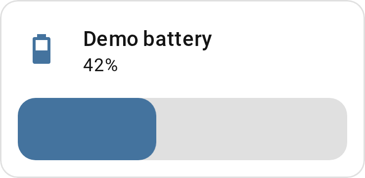
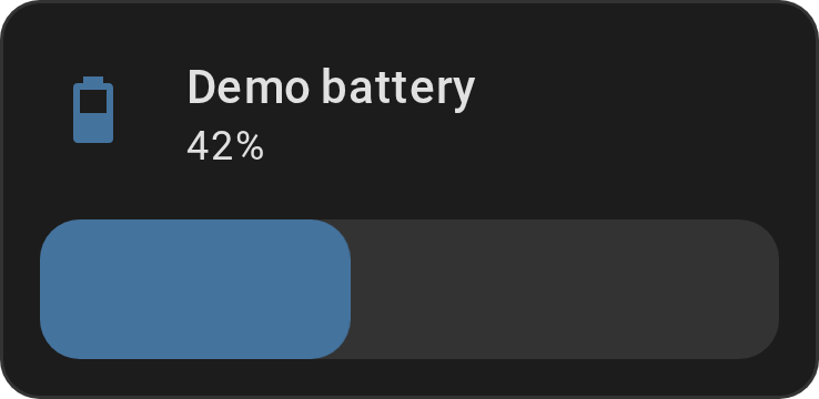
Show YAML
type: tile
entity: sensor.battery_level
features:
  - type: custom:entity-progress-feature
    entity: sensor.battery_level
Overlay mode — anchor the bar to the top or bottom of the tile without increasing the card height:
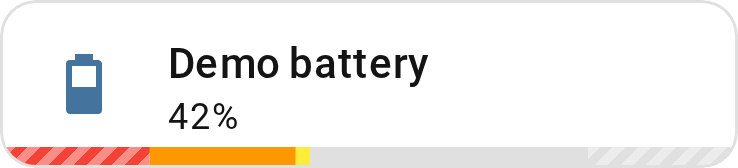
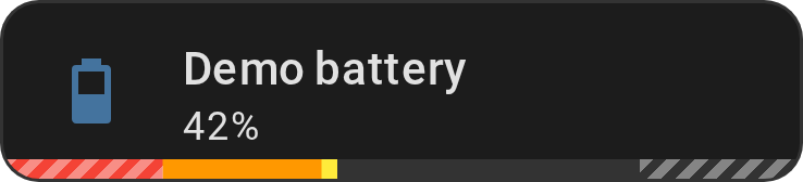
Show YAML
type: tile
entity: sensor.battery_level
features:
  - type: custom:entity-progress-feature
    entity: sensor.battery_level
    bar_position: bottom
    theme: optimal_when_high
    bar_color_mode: segment
    watermark:
      type: striped
      opacity: 0.4
      low:
        value: 20
        color: white
      high:
        value: 80
        color: white
Entity Progress Multi-Card / Multi-Feature
Several entities, one card: instead of a wall of individual bars, stack them under a single header.
Best for: keeping a related group visually together without eating a grid cell per entity. Use it for a room's three window sensors, a car's tire pressures, or any small cluster of bars that only makes sense read side by side.
entity-progress-multi-card and entity-progress-multi-feature stack several
progress bars into a single card or a single Tile feature, instead of one bar
per entity/feature. Each bar is a real entity-progress-card in
density: single_line under the hood, so it keeps its own more-info tap, its
own colors, and its own state — the aggregator only stacks them and divides the
available height.
Options
Show options
| Option | Type | Default | Description | Link |
|---|---|---|---|---|
entities |
list (required) | — | List of row configs, at minimum an entity each |
Config Ref. |
reverse_secondary_info_row |
boolean (optional) | false |
Puts the bar before the text instead of after it | Config Ref. |
bar_aligned |
boolean/string (optional) | true |
Every row's bar starts at the same x | Config Ref. |
rows |
integer (optional) | one row per entity | entity-progress-multi-card only — Sections grid row span |
Config Ref. |
layout / bar_position |
string (optional) | horizontal / default |
entity-progress-multi-card only — rows as columns, bar behind the text |
Config Ref. |
Any option set at the top level (outside entities) applies to every item as a
shared default; a row can override it individually. bar_size defaults to
small for every row — pick xsmall to fit more rows in the same space.
Each row is a whole entity-progress-card in
density: single_line, so it shows its value by
default and takes the card's own options. Use hide: ['value'] to turn the
value off, and hide: ['icon', 'name'] for bars and values alone. A row takes
every Card option except layout, bar_position,
bar_single_line, density, frameless, marginless, multiline, height
and min_width: the multi-card sets those for all its rows.
Rows are plain cards, not Template cards: color and bar_color take fixed
values, not Jinja. For a color that follows the value, use
theme or
custom_theme; for a color that depends on a
condition, stack Template cards instead of a Multi-Card.
Lining the bars up. A Multi does it on its own:
bar_aligned, on by default, gives every row
the text column of the widest, so 9% and 78% leave their bars starting at
the same x. bar_max_width pins the bar
instead, and the text takes what is left. bar_aligned: false lets each row
size its own text.
See Full Configuration Reference.
Getting Started
Standalone card:
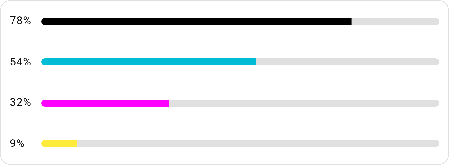
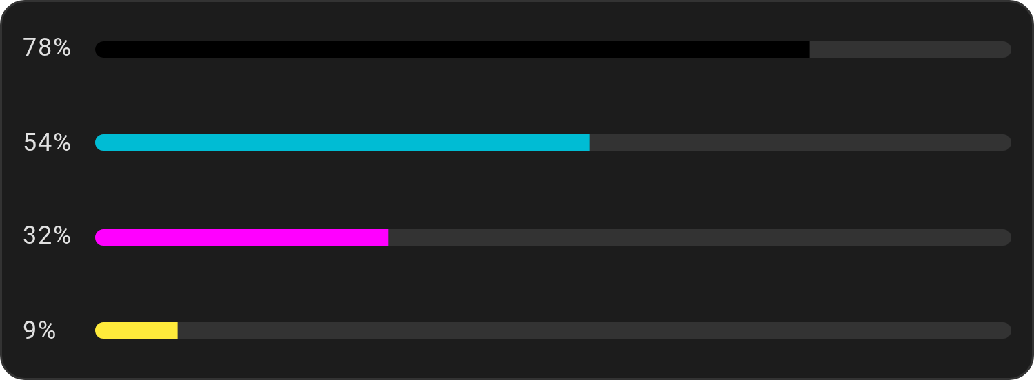
Show YAML
type: custom:entity-progress-multi-card
bar_size: small
decimal: 0
hide:
  - icon
  - name
entities:
  - entity: sensor.printer_black_cartridge
    bar_color: black
  - entity: sensor.printer_cyan_cartridge
    bar_color: cyan
  - entity: sensor.printer_magenta_cartridge
    bar_color: magenta
  - entity: sensor.printer_yellow_cartridge
    bar_color: yellow
Inside a Tile card:
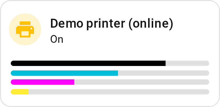
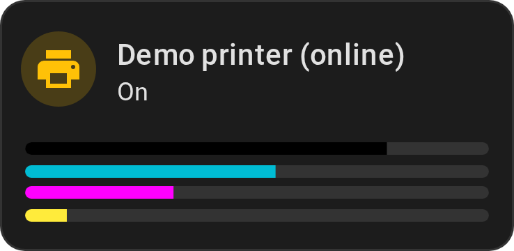
Show YAML
type: tile
entity: sensor.printer
name: Printer
features:
  - type: custom:entity-progress-multi-feature
    bar_size: xsmall
    hide:
      - icon
      - name
      - secondary_info
    entities:
      - entity: sensor.printer_black_cartridge
        bar_color: black
      - entity: sensor.printer_cyan_cartridge
        bar_color: cyan
      - entity: sensor.printer_magenta_cartridge
        bar_color: magenta
      - entity: sensor.printer_yellow_cartridge
        bar_color: yellow
grid_options:
  columns: 4
  rows: 1
Effects & formatting
Cross-cutting, work the same on every variant above, not tied to any one of them.
Visual Effects
Most of what makes this card feel alive doesn't show up in a static screenshot.
Each animation below is captured straight from
docs/demo-dashboard.yaml — the card's own showroom — so
what you see is exactly what you get, at real speed.
With a capture below: bar_effect,
bar_segments, bar_ring,
interpolate,
force_circular_background,
icon_animation, alert_when,
watermark, bar_color_mode,
status_label,
trend_indicator,
peak_marker, custom_theme,
bar_stack, center_zero,
hide: [shape] and
density: compact. Every other option, such as
bar_orientation or
layout, is documented in
configuration.md.
bar_effect: shimmer, wave, gradient, glass, radius
A light sweep loops continuously across the bar — the "still working" cue for
anything long-running. Combinable ([radius, shimmer]), reversible
(shimmer_reverse, gradient_reverse).
Show YAML
type: custom:entity-progress-card
entity: sensor.phone_battery
theme: critical_when_low
bar_effect:
  - shimmer
critical_when_low turns red under 10 %; for another limit, e.g. 20 %, see
custom_theme.
wave turns an upright fill into water: two drifting crests, bubbles rising
through it.
Show YAML
type: custom:entity-progress-card
entity: sensor.phone_battery
bar_position: background
bar_orientation: up
bar_effect:
  - wave
grid_options:
  columns: 6
  rows: 2
See bar_effect for the full list.
bar_segments: discrete blocks instead of a continuous fill
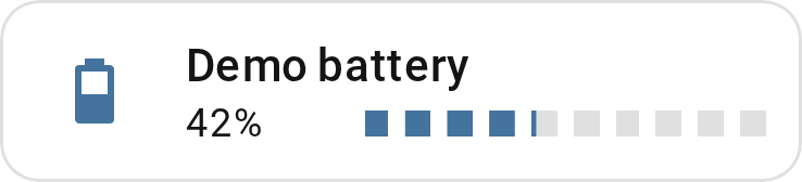
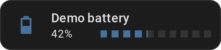
Battery-cell style — both the track and the fill are split into blocks, gaps visible on both the empty and filled portions:
Show YAML
type: custom:entity-progress-card
entity: sensor.battery
bar_segments: 10
Works with any orientation, size, or color mode/effect.
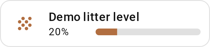
bar_ring: shape the ring around the icon
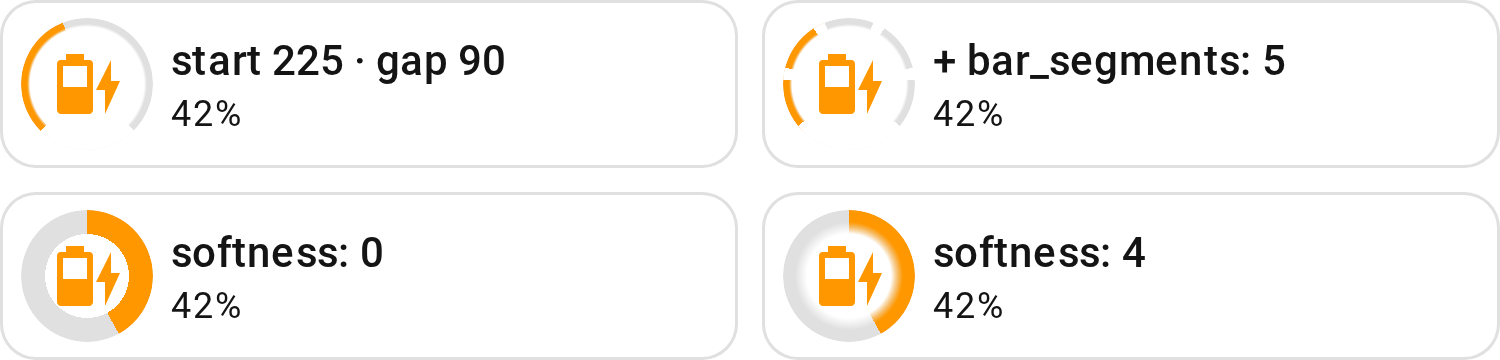
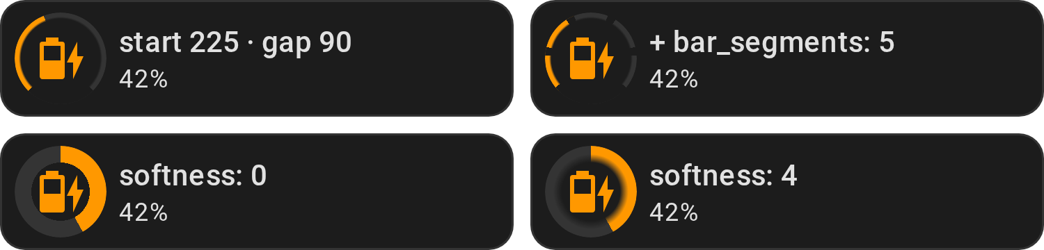
With bar_position: icon, the bar is a ring around the
icon. bar_ring opens it like a dial, and softness sets how its inner edge
blends: 0 for a crisp edge, a few pixels for a glow:
Show YAML
type: custom:entity-progress-card
entity: sensor.battery
bar_position: icon
bar_ring:
  start: 225
  gap: 90
type: custom:entity-progress-card
entity: sensor.battery
bar_position: icon
bar_size: xlarge
bar_ring:
  softness: 0
bar_segments cuts the ring into blocks too.
--epb-ring-softness sets the softness for a whole theme.
interpolate: smooth color transitions between zones
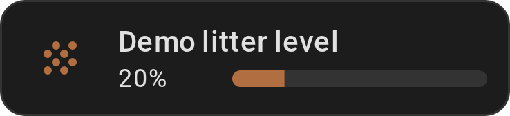
Without it, custom_theme zones cut sharply from one color to the next. With
it, the color blends smoothly as the value crosses each boundary:
Show YAML
type: custom:entity-progress-card
entity: sensor.tank_level
interpolate: true
custom_theme:
  - min: 0
    max: 50
    color: red
  - min: 50
    max: 100
    color: green
force_circular_background: the icon's circle, always on
The opposite of hide: [shape] — forces the circular
background behind the icon regardless of HA version, entity domain, or action
configured, for a consistent Mushroom-style look everywhere:
Show YAML
type: custom:entity-progress-card
entity: timer.living_room
force_circular_background: true
icon_animation: washing_machine, battery_charging, spin, ping
The icon itself reacts to what the entity is actually doing. washing_machine
and battery_charging check the entity's own domain-specific status, no config
needed beyond the name; the rest (spin, pulse, bounce, shake, ping,
reveal) play on any entity with a genuine active/inactive state — see
icon_animation for exactly how each one is
detected. In the capture, top row: washing machine, EV; bottom row: fan, light,
in the order of the code blocks below.
Washing Machine - Show YAML
type: custom:entity-progress-card
entity: sensor.washing_machine_progress
icon_animation: washing_machine
EV - Show YAML
type: custom:entity-progress-card
entity: sensor.ev_battery
icon_animation: battery_charging
Fan - Show YAML
type: custom:entity-progress-card
entity: fan.living_room
icon_animation: spin
Light - Show YAML
type: custom:entity-progress-card
entity: light.living_room
icon_animation: ping
Pair icon_animation: battery_charging with
theme: battery_adaptive and the bar reacts too,
not just the icon - both read the same battery_charging attribute:
Show YAML
type: custom:entity-progress-card
entity: sensor.ev_battery
theme: battery_adaptive
bar_color_mode: rainbow_full
icon_animation: battery_charging
alert_when: the card reacts on its own
A ring bursts around the card the moment a threshold is crossed — impossible to
miss on a wall-mounted dashboard, no card_mod needed.
Show YAML
type: custom:entity-progress-card
entity: sensor.disk_usage
name: Disk Usage
icon: mdi:harddisk
theme: critical_when_high
alert_when:
  above: 80
  color: red
  highlight: border
  animation: ping
highlight: label reuses the status_label
pill instead of touching the border/background — a fixed piece of text that only
shows up while the alert is actually active:
Show YAML
type: custom:entity-progress-card
entity: sensor.server_disk_usage
alert_when:
  above: 90
  color: red
  highlight: label
  label: 'HIGH'
The threshold itself doesn't have to be a fixed number either — an entity: Show YAML
type: custom:entity-progress-card
entity: sensor.cpu_temperature
alert_when:
  above:
    entity: sensor.cpu_temperature_limit
  color: red
or a full Jinja condition, returning an object to override just that push (anything left out falls back to the static value below): Show YAML
type: custom:entity-progress-card
entity: sensor.cpu_temperature
alert_when:
  jinja: >-
    {% set t = states('sensor.cpu_temperature') | float %}
    {% if t > 90 %}{{ {'color': 'red', 'animation': 'ping'} }}
    {% elif t > 80 %}{{ {'color': 'orange'} }}
    {% else %}false{% endif %}
  color: red
  animation: static
highlight: background paints the whole card instead of just the border -
animation: blink toggles it on and off instead of a single pulse:
Show YAML
type: custom:entity-progress-card
entity: sensor.cpu_temperature
alert_when:
  below: 10
  color: orange
  highlight: background
  animation: blink
See alert_when for every
highlight/animation combination, and watermark/min_value/max_value for
the same entity-or-Jinja pattern applied to thresholds that don't alert.
watermark: markers without leaving the bar
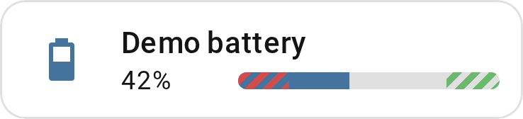
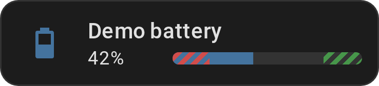
Low/high reference lines drawn directly on the bar — six styles
(blended/area/striped/triangle/round/line), each reading differently
at a glance:
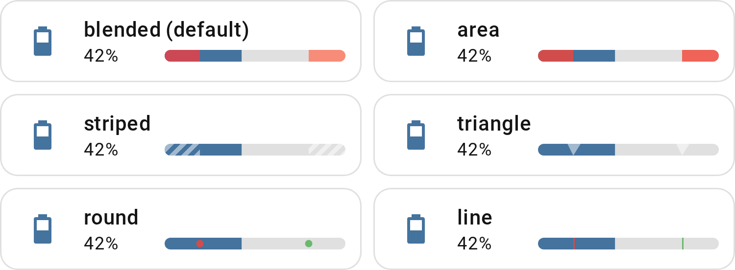
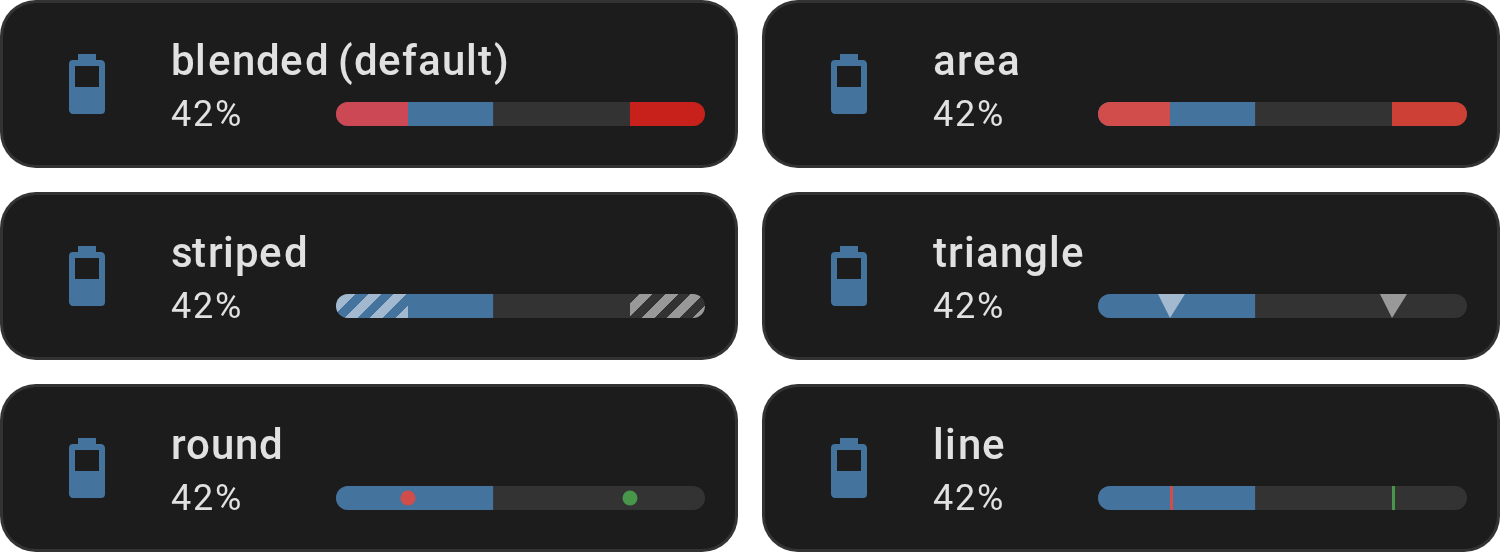
Show YAML
type: custom:entity-progress-card
entity: sensor.water_tank_level
watermark:
  low:
    value: 20
    color: red
  high:
    value: 80
    color: green
  type: striped
That's type: striped - see watermark for what
the other five (blended, area, triangle, round, line) each look like.
bar_color_mode: segment: theme zones as distinct blocks
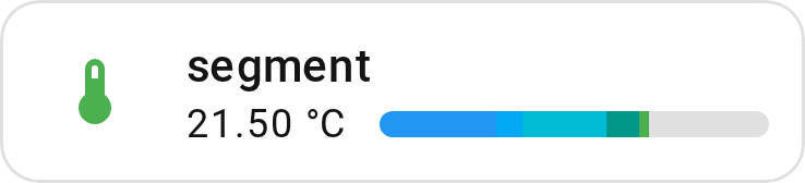
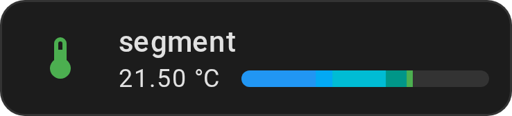
Each theme zone renders as its own colored block, visible up to the current value — useful to see at a glance how far through each zone the entity has progressed, instead of one flat fill color.
Show YAML
type: custom:entity-progress-card
entity: sensor.outdoor_temperature
theme: temperature
max_value: 40
bar_color_mode: segment
bar_color_mode: rainbow_full: the whole theme, always visible
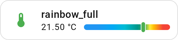
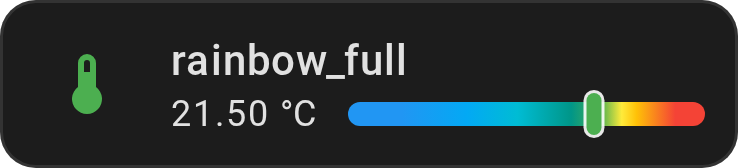
The track shows the theme's complete gradient end to end, with a marker sliding along it — useful when the zones themselves matter more than how full the bar is.
Show YAML
type: custom:entity-progress-card
entity: sensor.outdoor_temperature
theme: temperature
max_value: 40
bar_color_mode: rainbow_full
See bar_color_mode for segment and plain
rainbow.
status_label: a GitHub-style pill, colored automatically
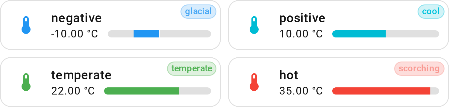
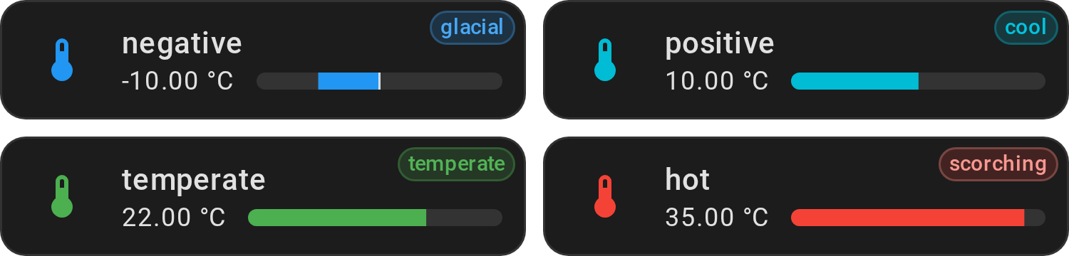
A short piece of text — glacial, scorching, ok — with no color to pick
yourself: the pill's background/border/text are derived from whatever color the
bar is already showing (theme zone, custom_theme zone, or a plain
bar_color), the same recipe GitHub's own issue labels use. Established
weather-report terms instead of a plain cold/hot split, still just a Jinja
condition on the value — no zone list to keep in sync with the theme.
Show YAML
type: custom:entity-progress-card
entity: sensor.outdoor_temperature
theme: temperature
max_value: 40
status_label:
  jinja: >-
    {% set t = states('sensor.outdoor_temperature') | float %}
    {% if t < -5 %}glacial
    {% elif t < 5 %}cold
    {% elif t < 15 %}cool
    {% elif t < 25 %}temperate
    {% elif t < 32 %}warm
    {% else %}scorching
    {% endif %}
  position: right
See status_label for the {label, color}
object form and color_source.
trend_indicator: which way the value is moving
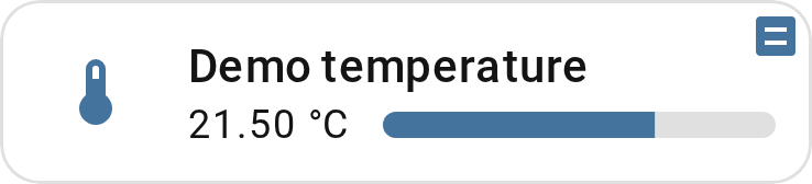
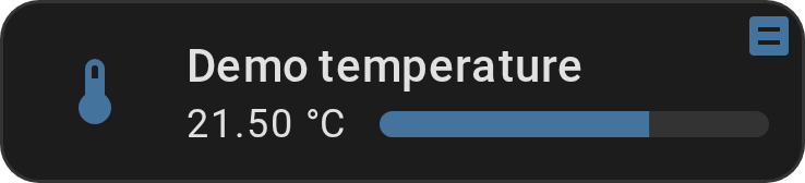
A small chevron in the top-right corner — up, down, or flat. Shares that corner
with status_label, which wins if both are set:
Show YAML
type: custom:entity-progress-card
entity: sensor.temperature
trend_indicator: true
peak_marker: min/max/average, right on the bar
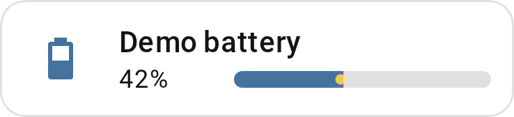
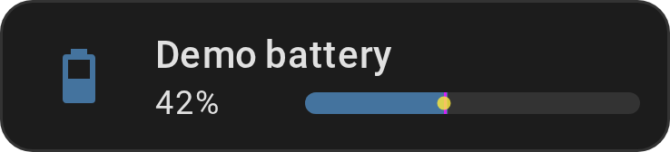
Marks the minimum, maximum, and average value seen over a time window, directly
on the bar — Card only. Each mark is opt-in: true (top-level
type/opacity), a color string (shorthand), or a full
{ type, opacity, color } override:
Show YAML
type: custom:entity-progress-card
entity: sensor.temperature
peak_marker:
  window: 2h
  min: cyan
  max: magenta
  average:
    type: round
    color: yellow
custom_theme: your own color zones
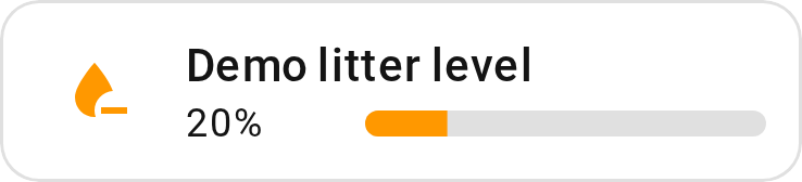
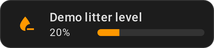
Not every value fits a built-in theme. Define your own value-range → color (+ icon) rules directly:
Show YAML
type: custom:entity-progress-card
entity: sensor.tank_level
custom_theme:
  - min: 0
    max: 20
    color: red
    icon: mdi:water-alert
  - min: 20
    max: 60
    color: orange
    icon: mdi:water-minus
  - min: 60
    max: 100
    color: green
    icon: mdi:water-check
bar_stack: several entities, one bar


Three modes, three different questions answered:
-
stacked(default) — a breakdown, each entity keeps its own literal width. A home battery's charged capacity, with what's reserved shown separately:Show YAML
type: custom:entity-progress-card entity: sensor.battery_storage_soc bar_stack: entities: - entity: sensor.battery_storage_reserved color: orange -
proportional— every entity's share of a shared target, the bar always fills edge-to-edge. Several circuits against one breaker limit:Show YAML
type: custom:entity-progress-card entity: sensor.circuit_a_power max_value: 3000 bar_stack: mode: proportional entities: - entity: sensor.circuit_b_power - entity: sensor.circuit_c_power -
net— one algebraic total, positive or negative. Combined withcenter_zero, a balance that can go either way — grid draw when positive, export when negative:Show YAML
type: custom:entity-progress-card
entity: sensor.grid_consumption_power
min_value: -3000
max_value: 3000
center_zero: true
bar_stack:
  mode: net
  entities:
    - entity: sensor.solar_production_power
      subtract: true
See bar_stack for subtract, ordering, and
auto-shaded colors.
center_zero: bidirectional bars
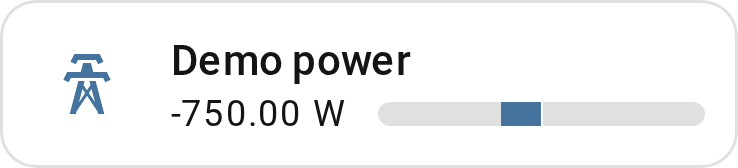
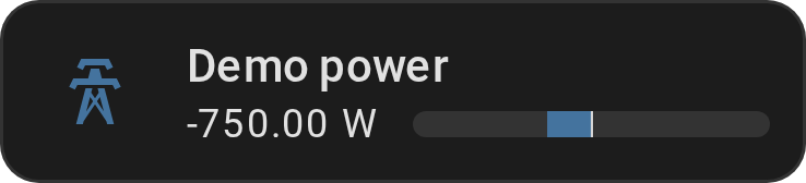
For anything that fluctuates around a baseline — a power balance, a temperature delta — the bar grows from the center instead of from an edge:
Show YAML
type: custom:entity-progress-card
entity: sensor.energy_balance
center_zero: true
min_value: -3000
max_value: 3000
See center_zero for a custom center point
(e.g. a nominal voltage) and bar_stack's net
mode, which combines naturally with it.
hide: [shape]: drop the icon's circular background
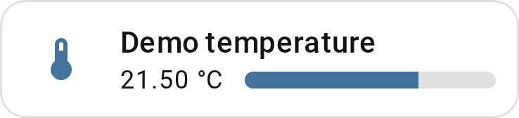
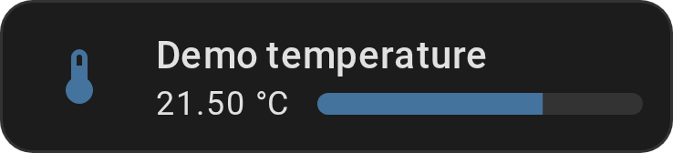
For a flatter look, without card_mod:
Show YAML
type: custom:entity-progress-card
entity: sensor.living_room_temperature
hide:
  - shape
Same result, via CSS instead of YAML: the
--epb-icon-shape-opacity hook.
density: compact: the smallest useful footprint, either layout
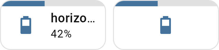
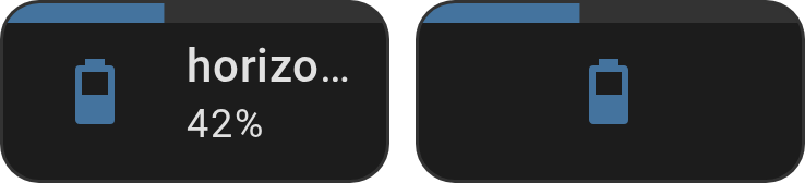
One option, two shapes depending on layout:
horizontal narrows the card to a single column, name and value still shown;
vertical has no matching narrow shape, so it hides name/ secondary_info
instead and drops to a single grid row — icon and a thin bar, nothing else:
Show YAML
type: custom:entity-progress-card
entity: sensor.cpu_usage
density: compact
type: custom:entity-progress-card
entity: sensor.cpu_usage
layout: vertical
density: compact
See density for exactly what it sets under the
hood (bar_position, hide, multiline) and how it interacts with a Sections
view's own grid sizing.
Display Formatting
Not animated, but just as much about the card reading correctly at a glance — how the number itself is shown.
unit_position: currency-style values
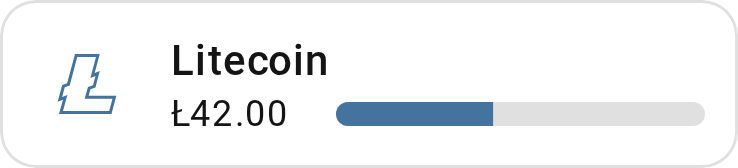
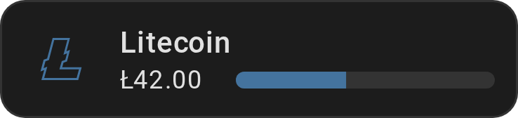
Show YAML
type: custom:entity-progress-card
entity: sensor.account_balance
unit: $
unit_position: before
unit_spacing: no-space
$100 instead of 100$. Has no effect once unit is empty or hidden.
value_compact: abbreviate large numbers
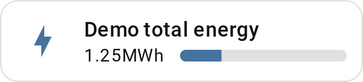
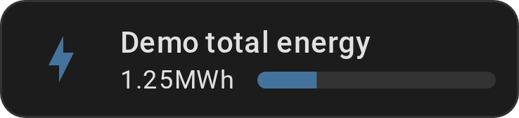
Show YAML
type: custom:entity-progress-card
entity: sensor.total_energy
value_compact: true
unit_spacing: no-space
1200 becomes 1.2K, 1500000 becomes 1.5M — locale-aware, trailing zeros
trimmed (1.2K, not 1.20K).
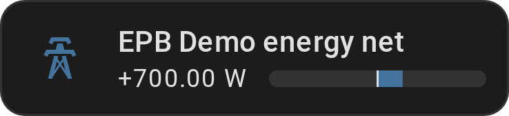
value_sign: force an explicit +/-
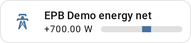
Show YAML
type: custom:entity-progress-card
entity: sensor.power_balance
center_zero: true
min_value: -3000
max_value: 3000
value_sign: true
42 becomes +42, zero stays unsigned. Clarifies the direction of a delta at a
glance — most useful on center_zero/bar_stack: { mode: net } cards.
Real-world recipes
Full narrative walkthroughs (why, how, and the YAML that got there), the ones
linked from the Card and Card Template Recipes above.
Recreate the Showcase
The animation at the top of the README isn't a mockup — it's this project's own demo dashboard (the "EP Showcase" view), built from ordinary options combined a bit more generously than usual. Here's exactly how four of its cards are put together; the others are in the same file.
Living room — full rainbow, centered, with a status pill
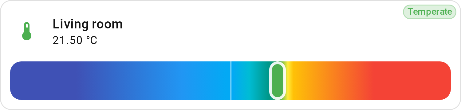
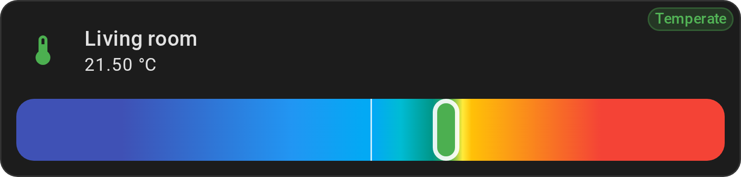
Show YAML
type: custom:entity-progress-card
entity: sensor.living_room_temperature
name: Living room
theme: temperature
bar_color_mode: rainbow_full
center_zero: true
bar_size: xlarge
status_label:
  jinja: Temperate
Four options doing the work: theme: temperature
supplies the color zones,
bar_color_mode: rainbow_full shows the
whole gradient with a sliding marker instead of a partial fill,
center_zero centers it, and a plain-text
status_label adds the pill — no Jinja
condition needed for a fixed label.
Garage — a pulsing alert on a vertical thermometer
Show YAML
type: custom:entity-progress-card
entity: sensor.garage_temperature
name: Garage
theme: temperature
layout: vertical
max_value: 40
decimal: 1
bar_color_mode: rainbow_full
alert_when:
  above: 30
  color: red
  highlight: label
  label: hot
  animation: ping
Same rainbow_full idea as Living room, this time
layout: vertical and an
alert_when label that only appears — and pings
— once the value actually crosses 30.
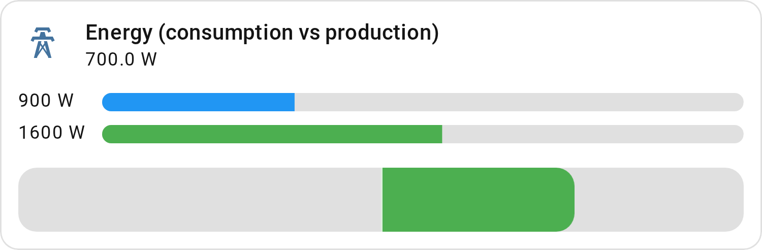
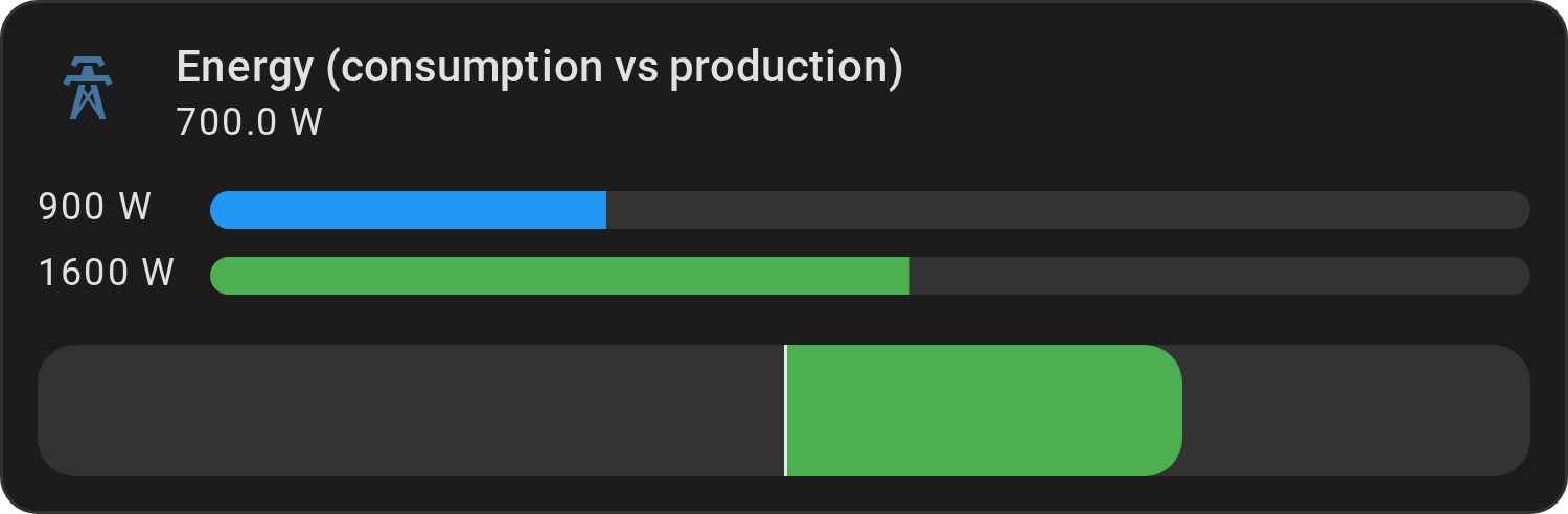
Energy — two bars and a net balance, in one Tile feature
Show YAML
type: tile
entity: sensor.energy_net
icon: mdi:transmission-tower
name: Energy (consumption vs production)
features:
  - type: custom:entity-progress-multi-feature
    bar_size: medium
    decimal: 0
    hide:
      - icon
      - name
    entities:
      - entity: sensor.grid_consumption
        bar_color: blue
        max_value: 3000
      - entity: sensor.solar_production
        bar_color: green
        max_value: 3000
  - type: custom:entity-progress-feature
    entity: sensor.solar_production
    center_zero: true
    min_value: -3000
    max_value: 3000
    bar_color: green
    bar_stack:
      mode: net
      entities:
        - entity: sensor.grid_consumption
          subtract: true
          color: blue
One native HA tile card, two of our features stacked inside it: an
entity-progress-multi-feature shows consumption and production side
by side with their values, and a second
entity-progress-feature below it renders the same data as one
bar_stack: net balance, center_zero centered.
Each Multi row prints its own value, and the Multi holds those values in one
column (bar_aligned, on by default) so the two
bars start at the same x whatever the reading — 900 W and 1600 W are not the
same width.
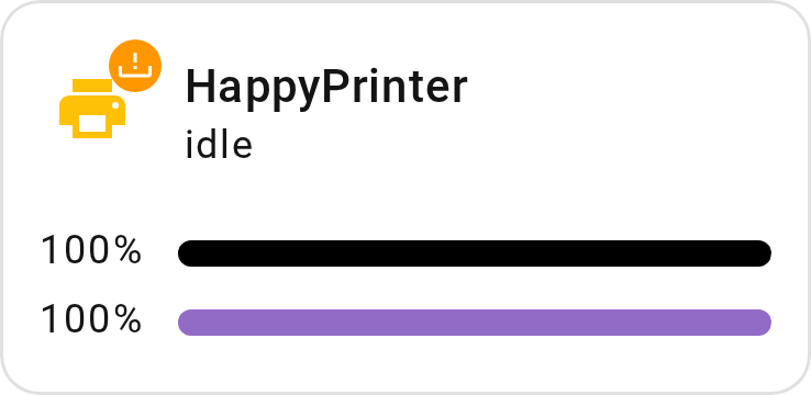
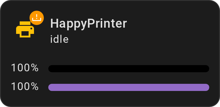
Printer — ink levels in a Mushroom Template card
Show YAML
type: custom:mushroom-template-card
entity: device_tracker.printer
primary: Printer
secondary: "{{ state_translated('sensor.printer') }}"
icon: >-
  {{ 'mdi:printer-off' if is_state('sensor.printer', 'unavailable')
     else 'mdi:printer' }}
color: >-
  {{ 'disabled' if is_state('sensor.printer', 'unavailable') else 'amber' }}
badge_icon: >-
  {% set black = states('sensor.printer_black_ink') %}
  {% set color = states('sensor.printer_color_ink') %}
  {% set paper = states('sensor.printer_paper') %}
  {% set known = black | is_number and color | is_number
     and paper | is_number %}
  {% if not known %}mdi:exclamation-thick
  {% elif paper | int in [1, 13] %}mdi:tray-alert
  {% elif black | int < 10 or color | int < 10 %}mdi:water
  {% else %}mdi:check
  {% endif %}
badge_color: >-
  {% set black = states('sensor.printer_black_ink') %}
  {% set color = states('sensor.printer_color_ink') %}
  {% set paper = states('sensor.printer_paper') %}
  {% set known = black | is_number and color | is_number
     and paper | is_number %}
  {% if not known %}orange
  {% elif paper | int == 13 %}red
  {% elif paper | int == 1 or black | int < 10 or color | int < 10 %}orange
  {% else %}green
  {% endif %}
tap_action:
  action: none
hold_action:
  action: none
double_tap_action:
  action: none
features:
  - type: custom:entity-progress-multi-feature
    entities:
      - entity: sensor.printer_black_ink
        bar_color: black
      - entity: sensor.printer_color_ink
        bar_color: purple
features_position: bottom
grid_options:
  columns: 12
  rows: 2
A third-party card can host our features too: the Mushroom Template card takes
an entity-progress-multi-feature under its content
(features_position: bottom), one bar per cartridge. The badge is the
template's own — it turns orange under 10 % ink or on a paper fault, and shows
the tile's orange exclamation mark when a sensor is unavailable.
The Laundry Mystery: Decoding Washer Entities Across Brands
Why?
Each washing machine brand has its own way of providing entities in Home Assistant. As a result, you often end up with multiple entities that have different names depending on the integration used. This can make managing these entities tricky, especially if you want a simple and clear card to track the standard elements of your washing machine.
The goal here is to simplify the display of important information related to your washing machine, regardless of the brand, by centralizing key data such as operational status, progress percentage, and remaining time, while maintaining flexibility to adapt to entity variations based on the integration used.
Searching for Entities
Before configuring your card, it's essential to research the specific entities for your washing machine integration: open Settings ➡️ Devices & services ➡️ Entities and search for "washing", then look for the entities that show the program state, the progress or the time left. Let's take this personal integration as an example:
sensor.washing_machine_operation_state: This entity is very specific to my washing machine brand and the Home Connect integration that comes with it. It tracks the machine's operation state (running, paused, etc.).sensor.washing_machine_progress_current_percentage: This is a custom sensor defined inconfiguration.yaml. The integration only reports a percentage when the machine is running. The template sets it to 0% when the integration reports 'unavailable'.sensor.washing_machine_remaining_program_time: This entity shows the estimated time left until the program finishes. However, the entity's name doesn't exactly match what the integration provides.
These entities are crucial for getting a complete overview of the washing machine's status, but they vary significantly depending on the brand and integration.
Setting Up the Card
Once the entities are identified, you can configure your card in YAML to display the necessary information.
Below an example that is currently used:
Show YAML
type: custom:entity-progress-card
entity: sensor.washing_machine_progress_current_percentage
name: Washing Machine
color: primary
tap_action:
  action: more-info
icon_tap_action:
  action: more-info
bar_color: primary
bar_size: large
badge_icon: >-
  {% if states('sensor.washing_machine_operation_state') == 'run'
  %}mdi:power-on{% else %}mdi:power-off {% endif %}
badge_color: >-
  {% if states('sensor.washing_machine_operation_state') == 'run' %} blue {%
  else %} disabled {% endif %}
name_info: >-
  {% if has_value('sensor.washing_machine_remaining_program_time') %} ready at
  {{ as_timestamp( states('sensor.washing_machine_remaining_program_time') ) |
  timestamp_custom('%H:%M', true) }}{% endif %}
In this example, the card displays:
- The progress percentage
- The operational status
- The remaining time
Conclusion
Using Jinja and custom entity configurations in Home Assistant provides advanced flexibility for adapting the card to the specifics of each washing machine. With this approach, you can create a single card that works with different integrations while displaying relevant information in a clear and consistent manner.
Washing Machine Progress: Three Brands, Three Approaches
Why?
Not every washing-machine integration exposes the same data, so how you get a progress percentage on the card depends entirely on which integration you're using. Here are three real, verified examples — from "just point the card at it" to "you need a helper".
What all three have in common: the icon animation
icon_animation: washing_machine behaves identically
on all three brands, and needs no configuration at all — you never name the
status entity. When entity is a plain sensor (a progress percentage, an
elapsed time…), the card checks every other entity of the same device and
animates while any of them reports run or in_use — exactly what Home
Connect, Miele and SmartThings each publish. All three examples below include
it.
1. Home Connect (Bosch/Siemens) — direct, no extra config
Home Connect exposes progress natively as a percentage sensor
(sensor.<appliance>_program_progress, 0-100%). Point entity at it, and read
the end of the cycle off sensor.<appliance>_program_finish_time
(device_class: timestamp):
Show YAML
type: custom:entity-progress-card
entity: sensor.washing_machine_program_progress
name: Washing Machine
icon: mdi:washing-machine
icon_animation: washing_machine
bar_size: large
name_info: >-
  {% if has_value('sensor.washing_machine_program_finish_time') %}ready at {{
  as_timestamp(states('sensor.washing_machine_program_finish_time')) |
  timestamp_custom('%H:%M', true) }}{% endif %}
2. Miele — Jinja max_value, no helper needed
Miele exposes elapsed_time and remaining_time (both in minutes,
device_class: duration) but no ready-made percentage. Combine them with a
Jinja max_value.
unit: '%' is required here: elapsed_time being a duration,
the card would otherwise print the raw elapsed time instead of the percentage.
The bar fill is correct either way — only the text label changes. Drop the line
if you would rather read 1h 12min than 63%.
Show YAML
type: custom:entity-progress-card
entity: sensor.washing_machine_elapsed_time
name: Washing Machine
icon: mdi:washing-machine
icon_animation: washing_machine
unit: '%'
bar_size: large
max_value:
  jinja: >
    {{ (states('sensor.washing_machine_elapsed_time') | float(0))
       + (states('sensor.washing_machine_remaining_time') | float(0)) }}
name_info: >-
  {% if has_value('sensor.washing_machine_remaining_time') %}{{
  states('sensor.washing_machine_remaining_time') }} min left{% endif %}
Note
Between two cycles, elapsed_time and remaining_time are both 0, so
max_value resolves to 0 as well. The card degrades to 0% rather than
erroring — that is expected, not a misconfiguration.
3. Samsung (SmartThings) — the animation is free, the progress is not
SmartThings only exposes machine_state (run/pause/stop), job_state
(the current phase) and completion_time (an absolute end-of-cycle timestamp) —
no elapsed time, no remaining time, and no start time to anchor a calculation.
The animation still works out of the box, exactly like the other two:
machine_state reports run, which is all the card looks for. The progress
bar is the part card config alone cannot solve — you first need to create
a start time yourself, then apply the "Simple Helper" technique from the next
recipe:
- Create an
input_datetimehelper (e.g.input_datetime.washer_start). - Add an automation that sets it to
now()wheneversensor.washing_machine_machine_statechanges torun. - Follow Cracking a Complex Case with a Simple Helper below,
using
input_datetime.washer_startas the start time andsensor.washing_machine_completion_timeas the end time.
Then add the same two lines as the other two brands to the resulting card:
icon: mdi:washing-machine
icon_animation: washing_machine
Cracking a Complex Case with a Simple Helper
Why?
We want to monitor a process and we have entities for:
- start time: states.sensor.print_puppy_start_time (time)
- finish time: states.sensor.print_puppy_end_time (time)
- and remaining time: sensor.print_puppy_remaining_time (min)
Our goal is to display the percentage of remaining time and show the remaining time in minutes. Unfortunately, the standard usage of this card cannot achieve what we need directly, but...
Mathematical Model
Using a simple model, we can calculate the percentage of remaining time with:
Where:
- \(P_{\text{remain}}\): Percentage of remaining time (the expected result).
- \(t_{\text{remain}}\): Remaining time (in minutes).
- \(\Delta T\): Total duration of the task (in minutes).
The good news is that we can use an entity to define the max_value and
dynamically calculate the percentage. Therefore, we need to find a way to
determine \(\Delta T\).
How?
We'll use a Helper (Number) to handle this calculation. It's simple to define and can be set up according to various needs.
- Go to
settings>Devices and services>Helpers>Create Helper>Template>Template a number -
Define the template to do the delta automatically
-
Choose a name and define your state template:
Show YAML
{% set start_time = states.sensor.print_puppy_start_time.state %}
{% set end_time = states.sensor.print_puppy_end_time.state %}
{% if start_time and end_time %}
  {{ ((as_datetime(end_time) - as_datetime(start_time)).days * 1440) + ((as_datetime(end_time) - as_datetime(start_time)).seconds / 60) | int }}
{% else %}
  unknown
{% endif %}
Check your syntax. Here, we are using entity values; therefore, we access the value through xyz.state. Sometimes, the value will be an attribute.
-
Set the minimum, maximum, step value, and unit accordingly.
- Check the current value to ensure it's working properly.
-
-
Define the card:
Show YAML
type: custom:entity-progress-card
entity: sensor.print_puppy_remaining_time
max_value: number.totaldurationofthetask
decimal: 0
bar_color: green
icon: mdi:clock-end
Conclusion
By implementing this model through the helper, we can accurately calculate and display the percentage of remaining time for any task. This approach provides a dynamic and intuitive way to monitor progress, ensuring that the displayed percentage accurately reflects the time remaining regardless of the task's total duration. This solution effectively extends our card usage vision, and enhances the user experience.
Don't Let It Expire! (SSL Certificate Countdown)
This example is similar to the previous one that used a Home Assistant helper but relying more on system-level tools — offering potentially greater efficiency at the cost of increased system dependency. We provide this example for illustration purposes only. Make sure to verify that no integration already exists before attempting this type of deployment. In the epilogue, we suggest a more universal way to achieve the same result.
Why?
SSL certificates are critical for securing HTTPS connections. If one expires, it can make your services inaccessible — including your Home Assistant interface when accessed remotely.
The challenge? Certificates (especially Let's Encrypt) usually last only 90 days, and it's easy to forget when they expire.
👉 The goal here is to automatically track how many days are left (countdown) before your SSL certificate expires and visually display this countdown as a color-coded progress bar in the Lovelace dashboard.
How?
Here, we're using a Home Assistant instance running in Docker with access to Linux commands.
We will:
- Create a custom command_line sensor that calculates the number of days until the certificate expires.
- Setup the card with the new sensor.
- Add dynamic color coding to indicate urgency (red when close to expiry, green when safe).
Implementation
-
Create the command_line sensor, add this to your configuration.yaml (or sensors.yaml if split):
Show YAML
sensor:
  - platform: command_line
    name: 'SSL Certificate Expiry'
    command: >
      echo $(( ($(date -u -d "$(curl -vI --insecure https://<hostname>:<port>
      2>&1 | grep -i 'expire date' | awk -F': ' '{print $2}' | sed -E
      's/Jan/01/; s/Feb/02/; s/Mar/03/; s/Apr/04/; s/May/05/; s/Jun/06/;
      s/Jul/07/; s/Aug/08/; s/Sep/09/; s/Oct/10/; s/Nov/11/; s/Dec/12/' | awk
      '{print $4"-"$1"-"$2" "$3}')" +%s) - $(date +%s) ) / 86400 ))
    unit_of_measurement: 'days'
    scan_interval: 3600
You'll need to adjust this part to match your specific environment.
-
Add this card to your Lovelace dashboard:
Show YAML
type: custom:entity-progress-card
entity: sensor.ssl_certificate_expiry
name: SSL Certificate Expiry
icon: mdi:certificate
decimal: 0
min_value: 0
max_value: 90
bar_orientation: rtl
custom_theme:
  - min: 0
    max: 10
    color: red
  - min: 10
    max: 20
    color: yellow-color
  - min: 20
    max: 90
    color: green
grid_options:
  columns: 12
  rows: 1
Conclusion
With this setup, Home Assistant becomes a proactive security monitor for your SSL certificates. You get a clear visual on how much time is left — and can renew in time to avoid downtime.
This method is reusable for any use case that can be monitored at the system level.
Epilogue
It was fun to develop and can certainly be used as-is, but in practice, it relies on Linux system commands, which makes it less portable than the previous examples.
Ultimately, to meet the original goal, we can simply enable the cert_expiry
integration, which provides the certificate's expiration timestamp in a more
standardized and platform-independent way. Home Assistant helpers are powerful
tools, and whenever possible, they should be preferred to simplify
implementation.
With cert_expiry entity we can define a template helper (number) to generate a
countdown with:
- create the template helper
- define a name (number.cert_expiry_entity_id)
-
define state template
Show YAML
{% set target = states('sensor.<cert_expiry_entity_id>') %} {% if target not in ['unknown', 'unavailable'] %} {% set target_ts = as_timestamp(target) %} {% set now_ts = as_timestamp(now()) %} {% set diff = (target_ts - now_ts) / 86400 %} {{ diff | round(1) if diff > 0 else 0 }} {% else %} unknown # 0 to avoid error in HA log {% endif %} -
define min/max value: 0 and 90
- step: 1
- unit_of_measurement: days
Create the card:
Show YAML
type: custom:entity-progress-card
entity: number.cert_expiry_entity_id
name: SSL Certificate Expiry
icon: mdi:certificate
decimal: 0
bar_orientation: rtl
custom_theme:
  - min: 0
    max: 10
    color: red
  - min: 10
    max: 20
    color: yellow
  - min: 20
    max: 90
    color: green
unit: '%'
state_content: state
grid_options:
  columns: 12
  rows: 1
Now you have a working solution that avoids operating system dependencies and is more efficient within Home Assistant's ecosystem. Obviously, in the case of a Let's Encrypt certificate, it's recommended to:
- have a renewal process in place
- add a trigger to generate an alert before the certificate expires
These topics are beyond the scope of this guide.
Follow the Sun
Why?
You want a visual representation of the sun's next event (sunrise or sunset) and the progress until it happens, directly in your Home Assistant dashboard. Instead of showing static time values, you aim to give users contextual, visual feedback on when the next sun transition will occur, and how far along we are toward it.
How?
This card uses custom:entity-progress-card-template and dynamic Jinja2
templates to show:
nameshows:- Next Rise: HH:MM if sunrise is next,
- Next Setting: HH:MM if sunset is next,
- or a fallback if sun data isn't available.
bar_colorandcolor:- Bar turns orange when the sun is above the horizon.
- Turns light gray / invisible when it's below the horizon.
secondaryshows a live countdown (e.g., in 02:34:12) until the next sun event, accounting for whether sunrise or sunset is next.percentis the progress between the last and the next sun event.- For example, at 50%: you're halfway between yesterday's and today's sunrise.
- Or halfway between yesterday's and today's sunset, depending on current time.
tap_actionopens the standard more-info view for thesun.sunentity when tapped.
Show YAML
type: custom:entity-progress-card-template
name: >
  {% set sunrise = as_datetime(states('sensor.sun_next_rising')) %} {% set
  sunset = as_datetime(states('sensor.sun_next_setting')) %} {% set now_time =
  now() %} {% if sunrise and sunset %}
    {% if sunrise < sunset %}
      Next Rise: {{ sunrise.timestamp() | timestamp_custom('%H:%M', true) }}
    {% else %}
      Next Setting: {{ sunset.timestamp() | timestamp_custom('%H:%M', true) }}
    {% endif %}
  {% else %}
    Sun information not available
  {% endif %}
entity: sun.sun
fast_refresh: true
bar_color: |
  {% if states('sun.sun') == 'below_horizon' %}
    lightgray
  {% else %}
    orange
  {% endif %}
color: |
  {% if states('sun.sun') == 'below_horizon' %}
    none
  {% else %}
    orange
  {% endif %}
secondary: >
  {% set sunrise = as_datetime(states('sensor.sun_next_rising')) %} {% set
  sunset = as_datetime(states('sensor.sun_next_setting')) %} {% set now_time =
  now() %} {% if sunrise and sunset %}
    {% if sunrise < sunset %}
      {% set next_event = sunrise %}
      {% set last_event = sunrise - timedelta(days=1) %}
    {% else %}
      {% set next_event = sunset %}
      {% set last_event = sunset - timedelta(days=1) %}
    {% endif %}
    {% set delta = next_event - now_time %}
    {% set total_seconds = delta.total_seconds() %}
    {% if total_seconds > 1 %}
      {% set days = (total_seconds // 86400) | int %}
      {% set hours = (total_seconds % 86400) // 3600 %}
      {% set minutes = (total_seconds % 3600) // 60 %}
      {% set seconds = (total_seconds % 60) %}
      in
      {% if days > 0 %}
        {{ days }}d
      {% endif %}
      {{ '%02d:%02d:%02d' | format(hours | int, minutes | int, seconds | int) }}
    {% else %}
      now
    {% endif %}
  {% else %}
    --:--:--
  {% endif %}
percent: >
  {% set sunrise = as_datetime(states('sensor.sun_next_rising')) %} {% set
  sunset = as_datetime(states('sensor.sun_next_setting')) %} {% set now_time =
  now() %} {% if sunrise and sunset %}
    {% if sunrise < sunset %}
      {% set next_event = sunrise %}
      {% set last_event = sunrise - timedelta(days=1) %}
    {% else %}
      {% set next_event = sunset %}
      {% set last_event = sunset - timedelta(days=1) %}
    {% endif %}
    {% set total = (next_event - last_event).total_seconds() %}
    {% set elapsed = (now_time - last_event).total_seconds() %}
    {% if total > 0 %}
      {{ ((elapsed / total) * 100) | round(2) }}
    {% else %}
      0
    {% endif %}
  {% else %}
    0
  {% endif %}
tap_action:
  action: more-info
grid_options:
  columns: 6
  rows: 1
Conclusion
This card provides a beautiful and intuitive sun progress indicator, using both visual (progress bar + color) and textual (countdown + time) information. It adapts based on current time and sun data, making it a smart and engaging way to track solar cycles from your dashboard.